UNFI suppliers with ClearVue subscriptions can access all the ClearVue-specific dashboards in Crisp. UNFI Supply Chain by ClearVue subscribers can access the Fill Rate dashboard. The dashboards and their visualizations are listed below, and you can quickly jump to a specific visualization by clicking these links:
- Potential Lost Sales by Product
- Potential Lost Sales by DC
- Potential Lost Sales Detail
- Total Pipe by Warehouse
- Forecast vs Quantity on Hand by DC
- Weeks on Hand by DC
Potential Lost Sales
This dashboard combines Vendor Browse reports to identify where you may be missing out on sales due to low inventory.
Potential Lost Sales by Product
This takes your weekly UNFI demand forecast and compares it to your quantity on hand. The yellow bars represent the deficit between the two, while the green bars show the wholesale dollars at risk. Right click on a bar and select "Show all" to see a breakdown of the deficit.

Potential Lost Sales by DC
Similar to the above chart, the Potential Lost Sales by DC visualization compares your UNFI demand forecast with your quantity on hand and rolls them up to the distribution center level. Hover over a bar for more information or click on a bar to filter the dashboard by that DC.

Potential Lost Sales Detail
This sortable table breaks down potential lost sales in greater detail by showing by product+DC combinations.

Total Pipe by Warehouse
This chart compares your weekly forecast and with your total warehouse pipe (cases on hand and on order). Right click on a bar to see a breakdown by product.

Forecast vs Quantity on Hand by DC
This chart focuses solely on what you have on hand at a DC versus what the demand forecast is. If your on hand quantity is low compared to the forecast, scroll up to review the Total Pipe by Warehouse visualization to see how much is on order.

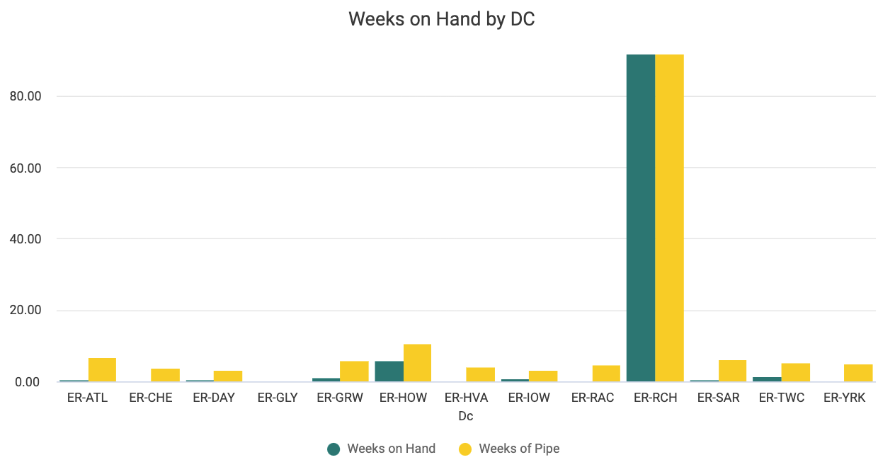
Weeks on Hand by DC
This chart presents another view of your supply chain. To come up with the number of weeks on hand, we've taken your on hand quantities by DC and then divided them by your weekly forecast. Weeks of pipe is calculated similarly, adding on order quantities to your on hands to show how many weeks you could go without any more orders.
Fill Rate
Using UNFI's Weekly Supplier Service Level report, this dashboard displays information that helps you hone in on your level of service to distribution centers and areas where you may be over or under-shipping. We calculate fill rate as quantity received divided by quantity ordered. If you see fill rates over 100% that means you have delivered more than was ordered. Fill rates less than 100% mean you have delivered less than was ordered. You can see the quantity ordered and quantity received in the Details table at the bottom of this dashboard to help you understand the numbers that went into the fill rate calculation.
Use the following map of the screen to help you understand the visualizations on this dashboard:
 Fill Rate Over Time
This visualization shows how your fill rate has changed over time, so you can gauge the health of your service level.
 Fill Rate Overview Tiles
These tiles provide high-level information about your fill rate performance and patterns. Once you add filters, these tiles add even more context, displaying your fill rate percentage for the selected time frame, the total number of orders, and the number of orders that were over and under filled.
 Fill Rate by Product, DC
These visualizations display your fill rate percentages by both product and distribution center. Hover on a bar for the exact percentage or click to filter the dashboard by product or DC.
Details (table)
This table provides more granular information to help you put your insights into action. You can click on a cell to filter the table or select the Tile actions menu (), then select Download data to export your data to an Excel file that you can easily share with others.
Spoilage Risk
In this dashboard, Crisp provides ClearVue subscribers with insights into what products at which DCs are at risk of expiring, an issue which can contribute to both food and financial waste.
Spoilage Risk by Product, DC
Hover for more details into how many wholesale dollars are at risk for a given product or with a specific DC. For a warehouse with an especially high dollar amount at risk, you may want to click on it to filter the dashboard by that DC and identify products on its shelves that need to move quickly.


Spoilage Risk Detail
Click the headers in this table to sort your products by expiration date, weeks to expiration, weeks on hand by lot, and wholesale dollars at risk by lot. For aberrant or unexpected figures, we recommend contacting UNFI or the individual distribution center. 