The visualizations on the supply chain tab are there to help you see the bigger picture of your business performance through KeHE. Using information from your KeHE "Full POD Vendor report," Crisp will mainly provide you with inventory and shipping information.
For most visualizations, you can drill down by clicking the "⋮" symbol to the right and then selecting "View Look."
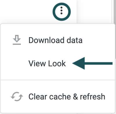
From there, click on whichever bar you'd like to get more information on:
In this tutorial, you will learn about each visualization available through the KeHE dashboard on the supply chain tab. Quickly jump to a specific visualization by clicking the links below.
Product on Hand by DC
Total Orders by DC
DC Locations
All Time DC Orders and Average Order Quantity
Current Weeks of Supply
Average Weeks of Supply at DC
Product Weeks on Hand
Historic DC Quantity on Hand
Average Quantity Shipped to Stores
Inventory at Risk
KeHE dashboard supply chain visualizations
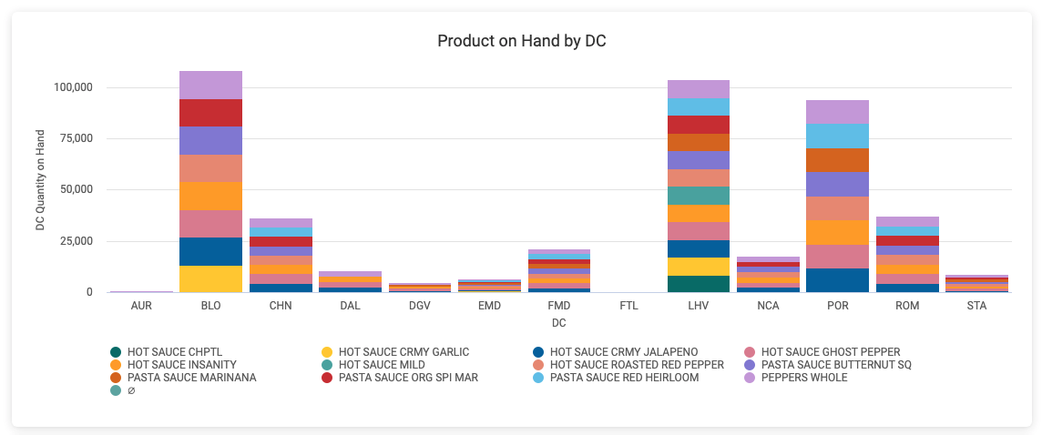
Product on Hand by DC
With the Product on Hand by DC visualization, you can quickly see in eaches which DCs ship the largest quantities and which are at risk. You can also identify areas of overstock and see if there is enough stock for a promotion.
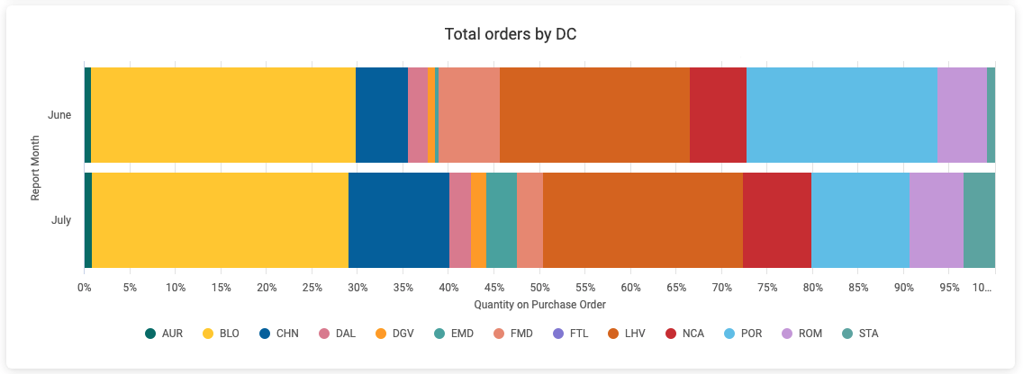
Total orders by DC
This graph surfaces information on what portion of each product was ordered in each month. Along with helping you maintain a history of order proportions by DC by product, you can also use this graph to aid in production planning and demand planning.
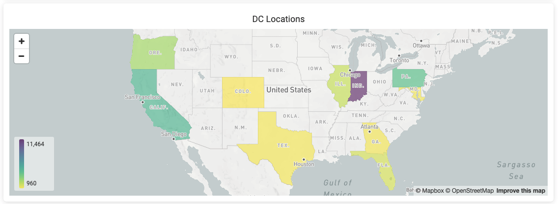
DC Locations
This heat map represents DC location by state and the quantity on hand and on purchase order. Uses include helping you visualize your distribution network and plan your upstream distribution. If a state appears in gray, this indicates the location of a DC with 0 product on hand and 0 product on order.
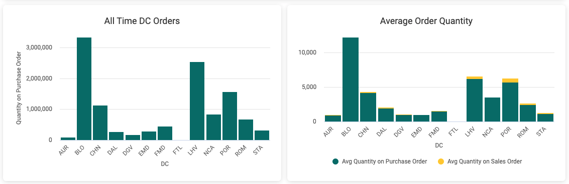
All Time DC Orders and Average Order Quantity
The All Time DC Orders graph presents an aggregate of all orders that have come into each DC. By showing volume by location, this can aid you in planning your upstream distribution network and production capacity
The Average Order Quantity visualization shows the average order by DC and can be used to compare current orders to the average to see anomalies (i.e.over ordering or under ordering).
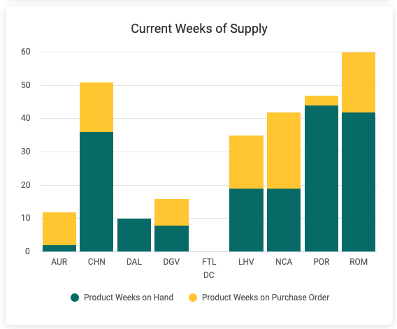
Current Weeks of Supply
The Current Weeks of Supply visualization show you the number of weeks of product KeHE has on hand compared to what's on purchase order. You can use this visualization to identify overstocks and assess where you might have too much cash tied up in inventory.
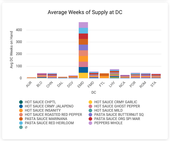
Average Weeks of Supply at DC
This chart represents the average weeks of supply by product and DC, which helps you identify systemic inventory problems where you are carrying too much or too little. Can be compared to your current on hand inventory situation to see if current on hands are where they should be.
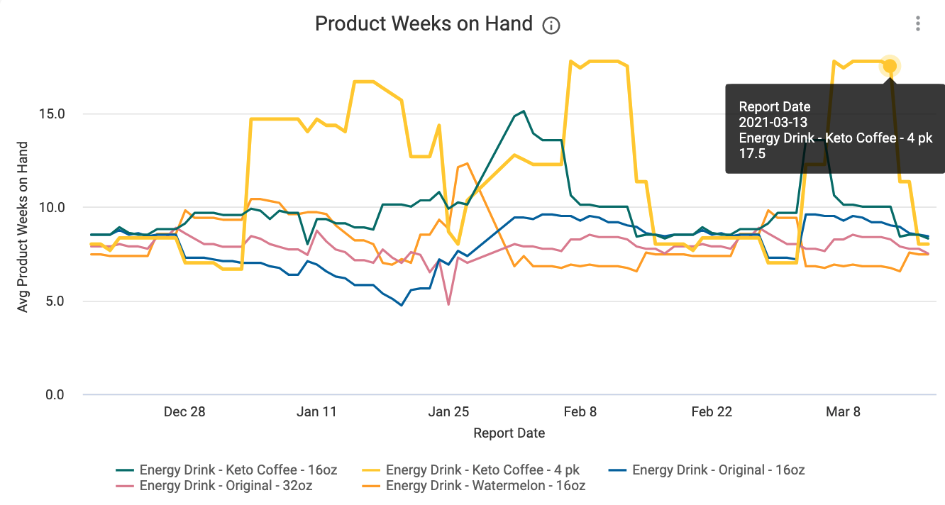
Product Weeks on Hand
This graph allows you to quickly check the approximate number of weeks worth of product KeHE has on hand at the daily level. Hover to learn more about each product or click to apply a filter. DCs with quantities exceeding 52 weeks are excluded from the total.
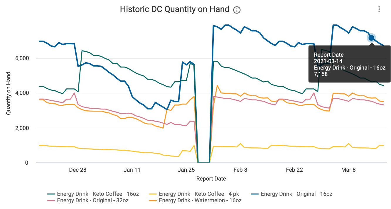
Historic DC Quantity on Hand
You can observe product quantity on hand over time by DC in this graph. Understanding how much product DCs historically have on hand can help you with production planning, inventory positioning and correlating promotion success with the quantity on hand at a particular time.
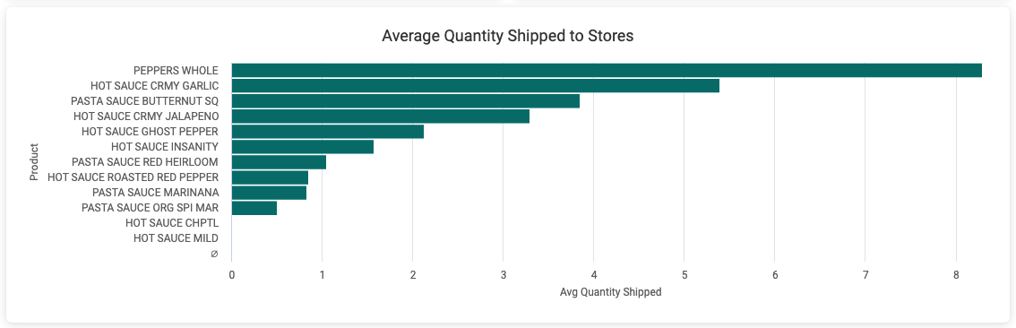
Average Quantity Shipped to Stores
This graph allows you to observe the quantity shipped by product in units. You can use this graph to highlight optimal case quantity, as well as identify how well prepared you are for a promotion out of a particular DC.
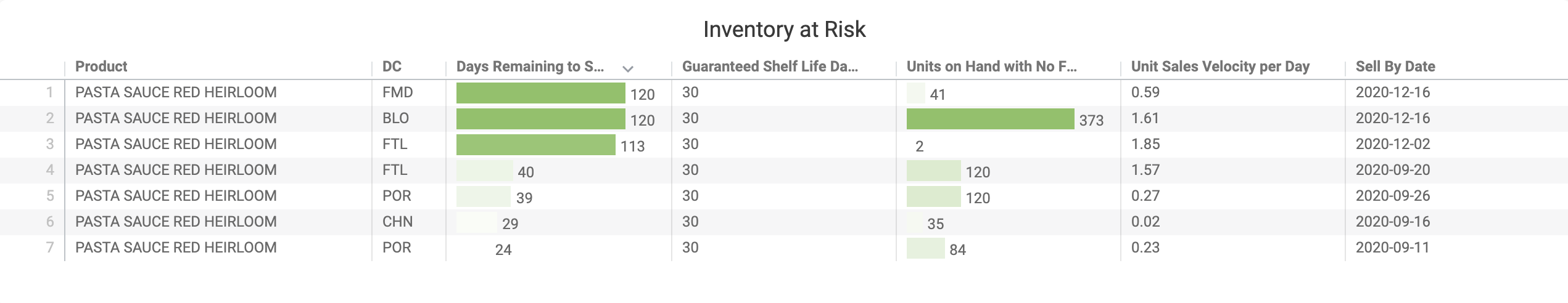
Inventory at Risk
KeHE provides its suppliers with an inventory at risk report. This visualization pulls the key elements from that report to help you quickly identify which products are at risk of surpassing the sell by date.