Crisp's Core dashboards provide the essential analytics for running a great food brand. This article focuses on the KeHE sales dashboard and its three sections: "Overview," or what's going on with your sales; "Drivers," or the events contributing to your sales; "Details," or granular information you can act on to improve your sales. Data for this dashboard comes from your monthly KeHE "Full POD Vendor" report.
In this tutorial, you will learn about each visualization available in the sales dashboard. Quickly jump to a specific visualization by clicking the links below.
Sales Dollars Over Time
Sales Quantity Over Time
Total Sales, Products, Locations
Sales by Product
Sales by State
Sales by City
Sales by Zip Code
Sales by Banner
Sales by Warehouse
Product Sales Over Time
Banner Sales Over Time
Sales by Customer by Product
Banners That Have Stopped Ordering
Overview
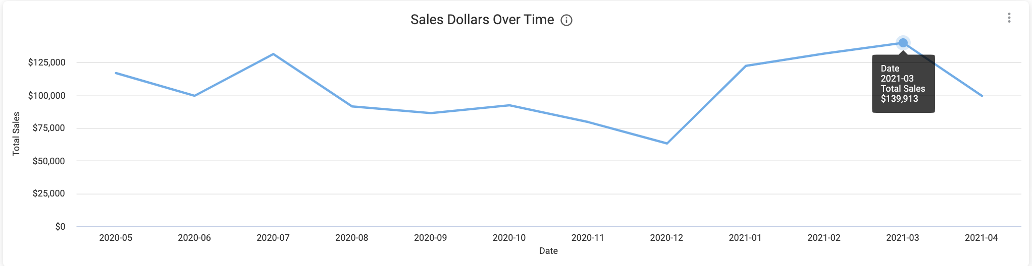
Sales Dollars Over Time
With the Sales Dollars Over Time visualization, you can chart growth, analyze promotions after they've happened, and recognize cyclical and seasonal patterns. Along with adding filters to hone in on specific products or time periods, you can also hover over data points in this graph for more information.
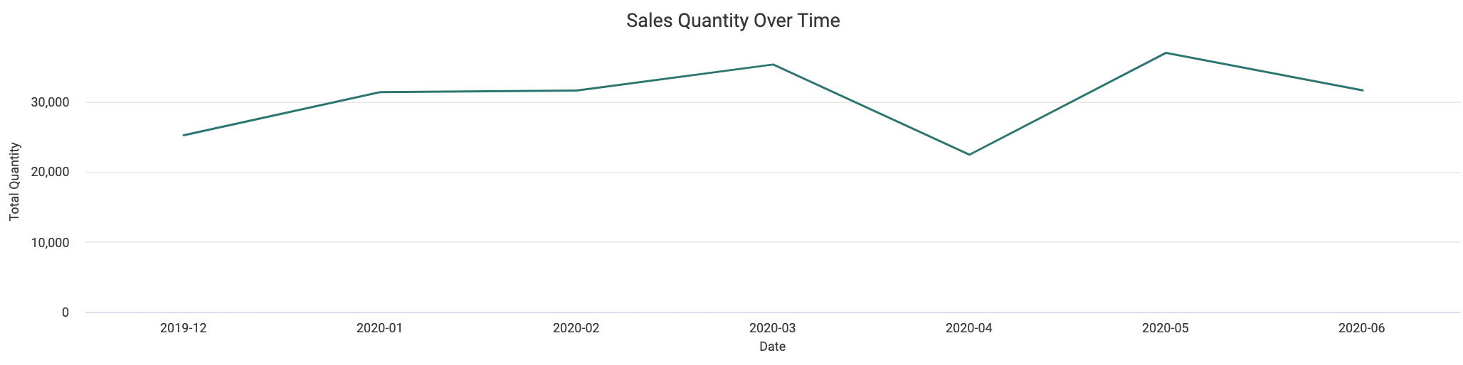
Sales Quantity Over Time
Much like the Sales visualization, the Sales Quantity Over Time graph can be used to both track and display patterns and growth, showing sales in units shipped.
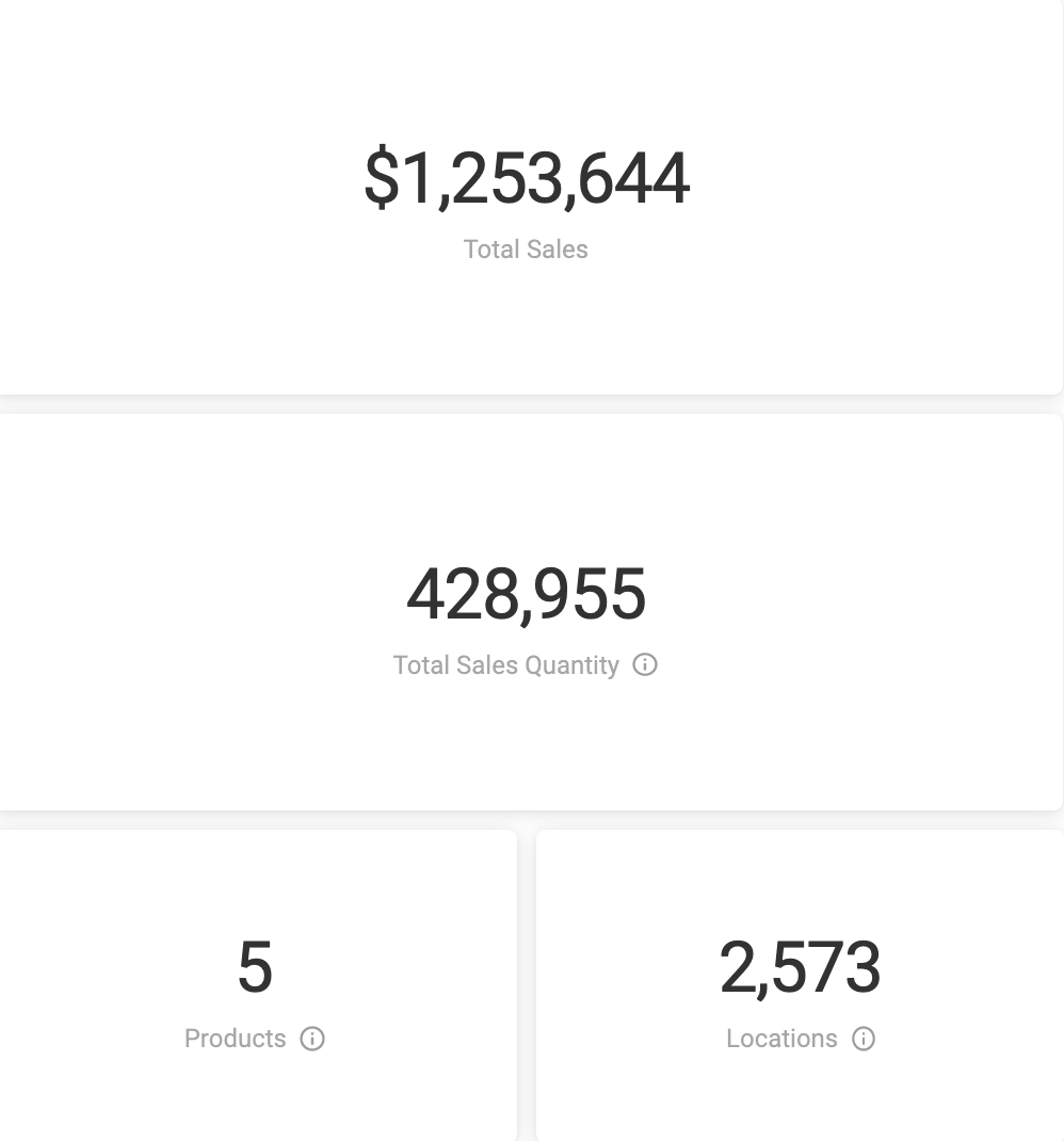
Total Sales, Products, Locations
At a first glance, these tiles offer sales summaries and provide high-level information about your sales performance and patterns. Once you've started enabling filters, these tiles add even more context, displaying exact counts in dollars, units, products, and locations based on the unique set of the name and address of the customer.
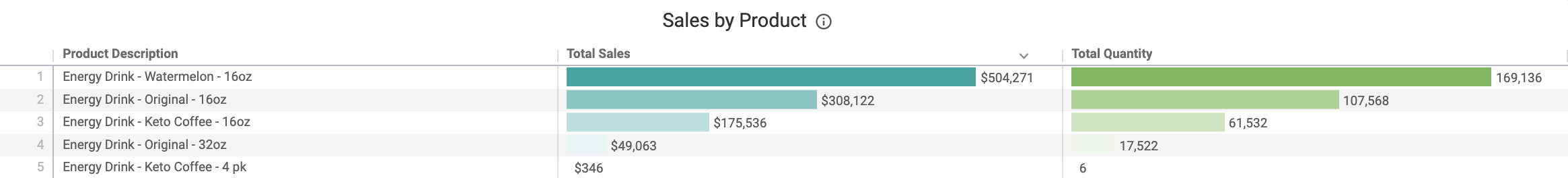
Sales by Product
This sortable table shows your top-performing products and changes based on your selected filters.
Sales Drivers
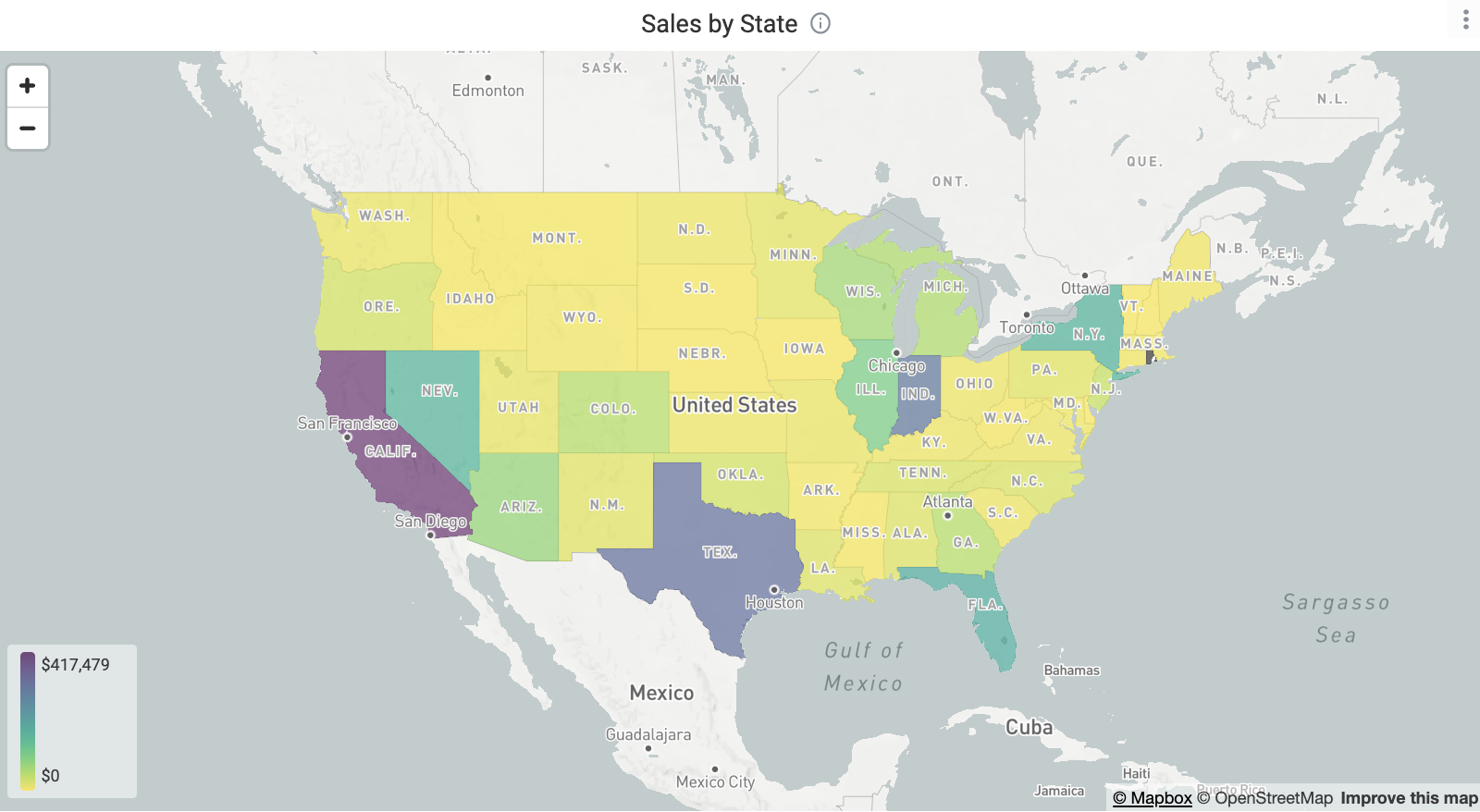
Sales by State
This regional heat map allows you to quickly observe regions where product popularity is high versus regions that are underperforming. Hover over a state to see sales dollars and sales quantity. States can also drilled into by zip code by right-clicking, enabling you and your marketing team to make more strategic decisions regarding SEO and distribution.
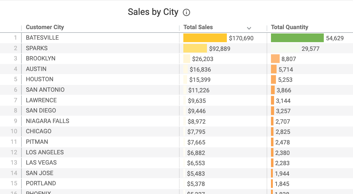
Sales by City
This sortable table can help you spot top-performing cities, which can aid in making decisions on product placement, as well as geo-targeting.
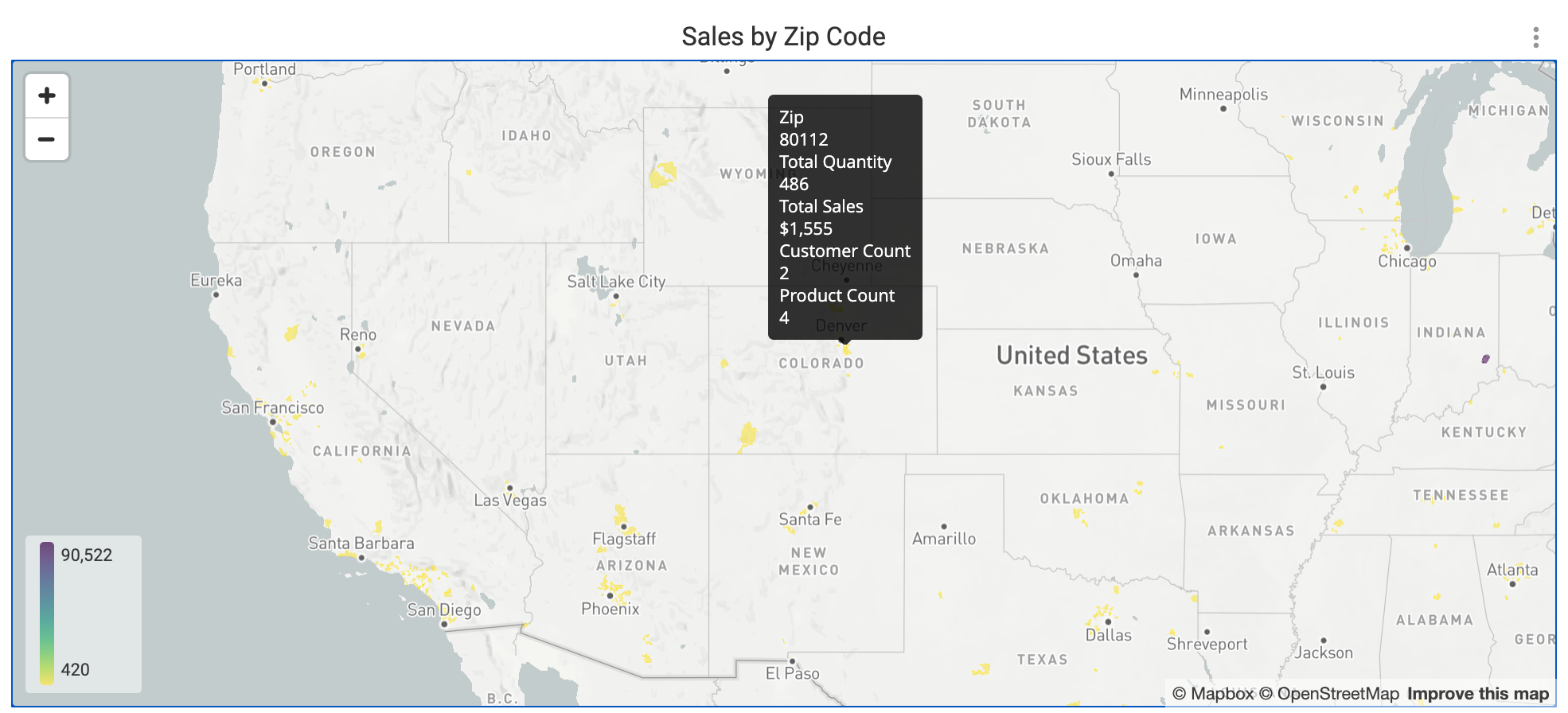
Sales by Zip Code
Hover over the colored portions of this heat map to see granular insights into specific areas. Useful for geo-targeting and tracking demo and promotional success, you can also click to apply that zip code as a cross-filter.
Sales by Banner
This table surfaces sales by banner in dollars and units, allowing you to view which banners are underperforming or not selling anymore.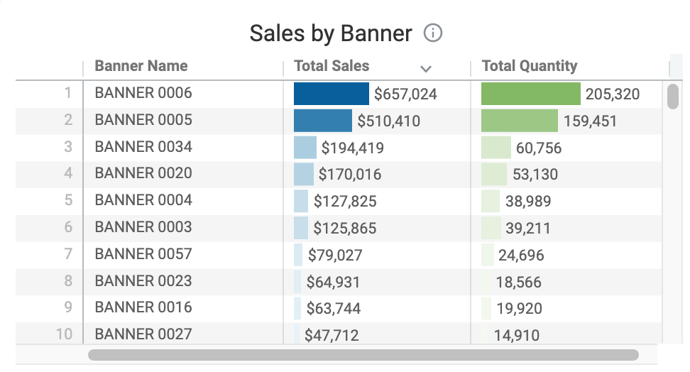
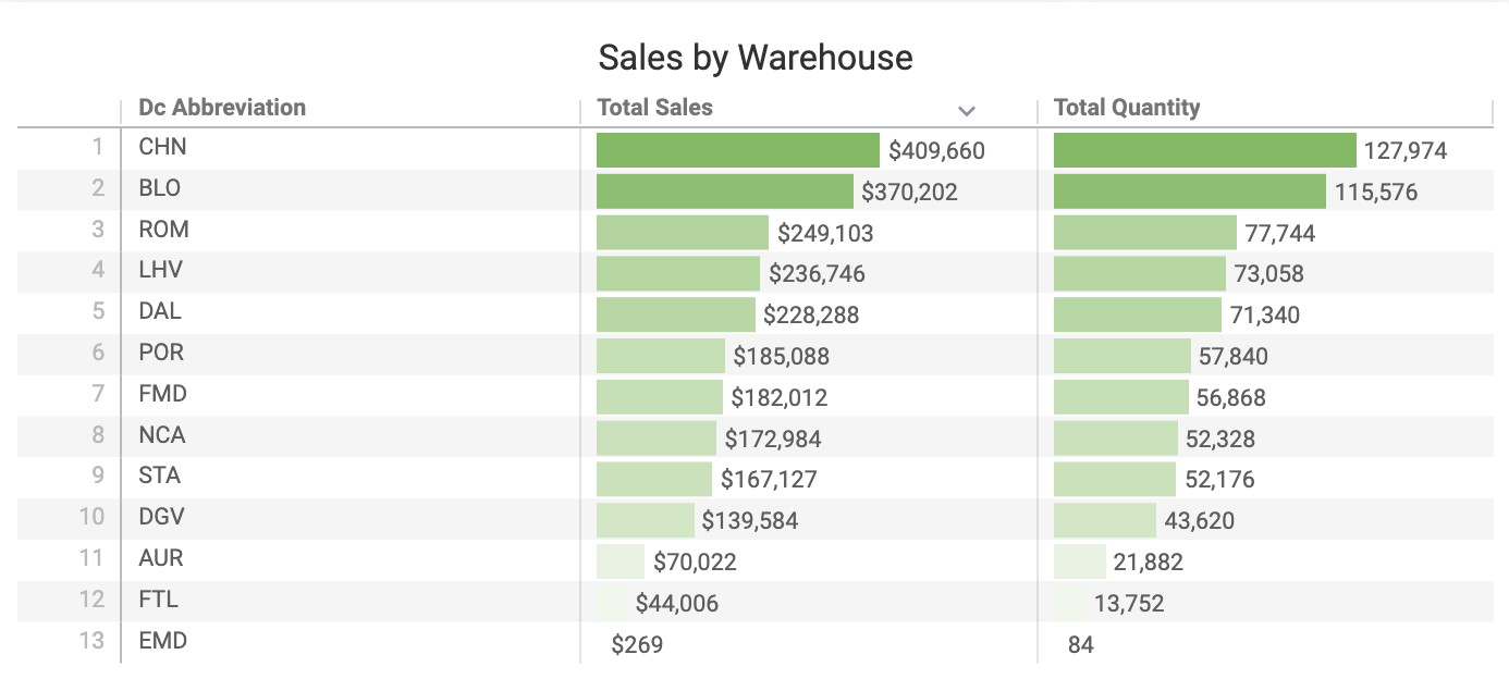
Sales by Warehouse
This sortable table displays sales by warehouse, giving you a better sense of regionality.
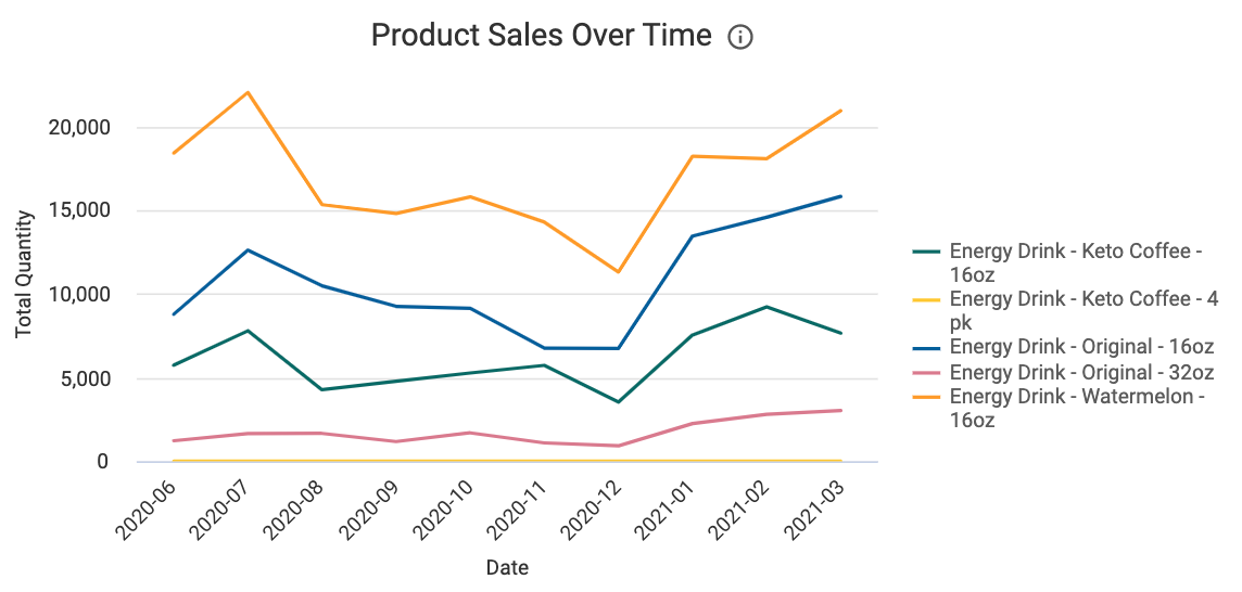
Product Sales Over Time
This graph assists in seeing how product sales grow or shrink over time. By comparing sales, you can better track how new products have performed or how seasonality affects your portfolio mix.
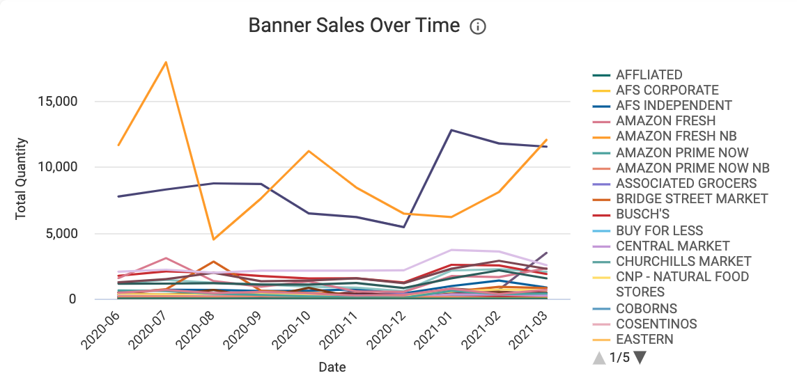
Banner Sales Over Time
This graph displays sales by banner, allowing you to see at a glance which banners your products are performing better in.
Sales Details
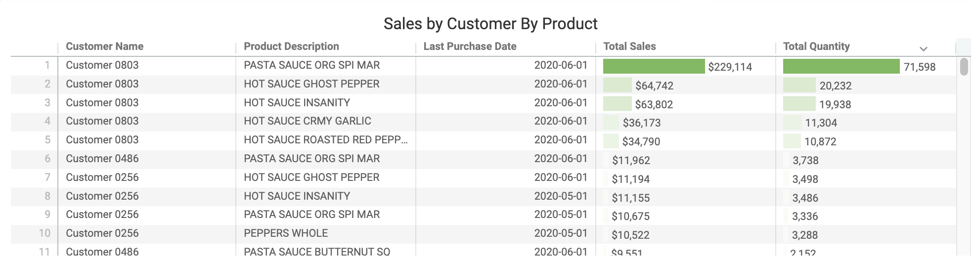
Sales by Customer by Product
This comprehensive table quickly surfaces which products are doing well (or need more attention) with specific customers.
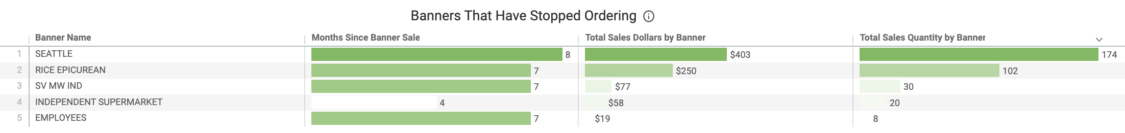
Banners That Have Stopped Ordering
The sortable table shows at a glance the number of months since a sale to a banner. If it's been a lengthy period of time since an order, a review of that banner could be warranted.