Using data from your Amazon Seller Central account, the dashboard succinctly displays insights on sales and shipping. In this tutorial, you will learn about each visualization available through the Amazon Seller Central sales dashboard. Quickly jump to a specific visualization by clicking the links below.
A Note About the Source Data
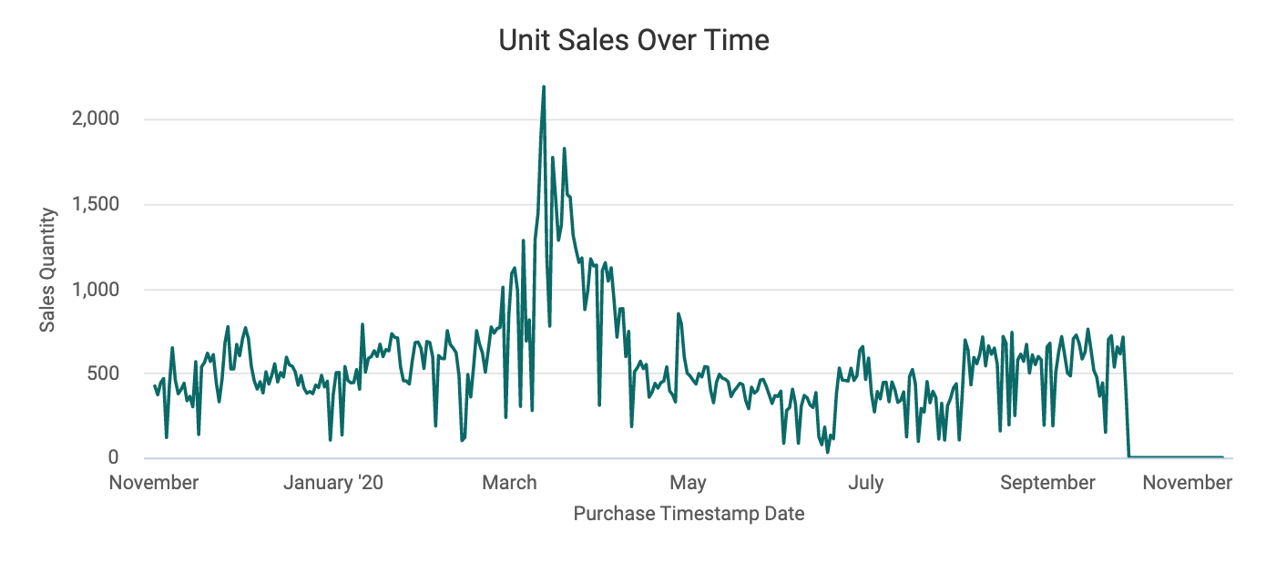
Unit Sales Over Time
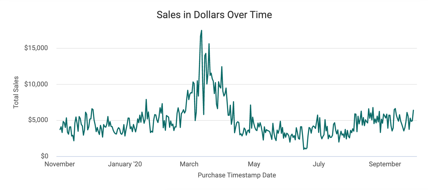
Sales in Dollars Over Time
Total Quantity, Total Sales, Total Orders
Sales by State
Product Share Over Time
Quantity Shipped by City
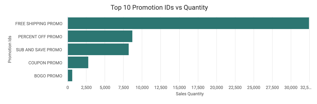
Top 10 Promotion IDs vs Quantity
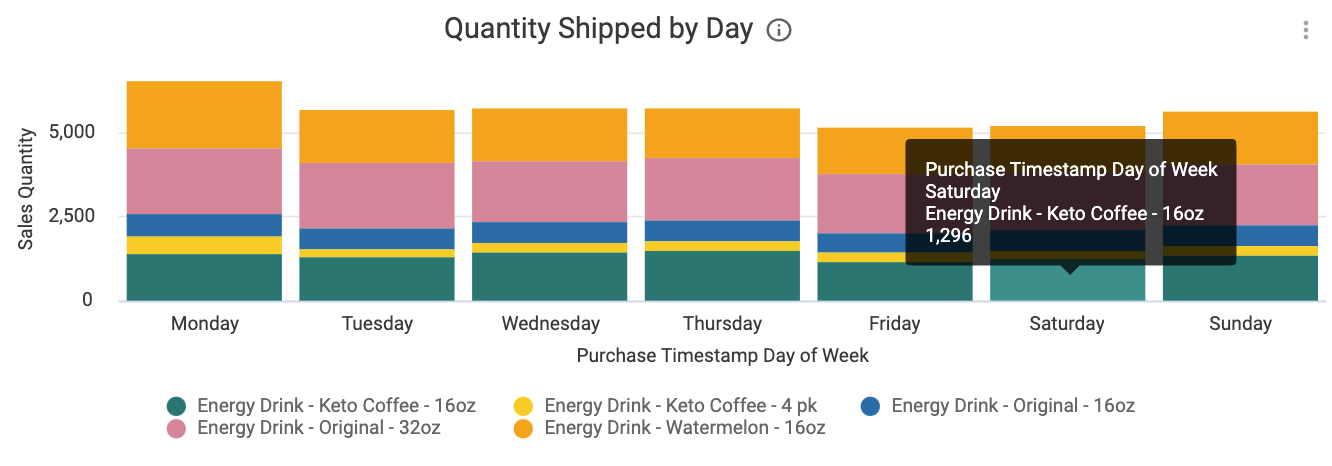
Quantity Shipped by Day
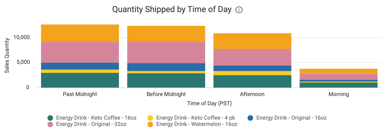
Quantity Shipped by Time of Day
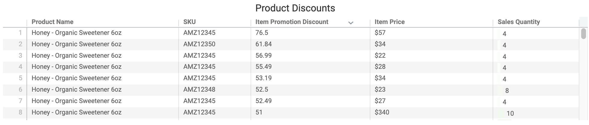
Product Discounts
Product Share
Business Orders vs Product
Business Orders
Sales Quantity by Zip Code
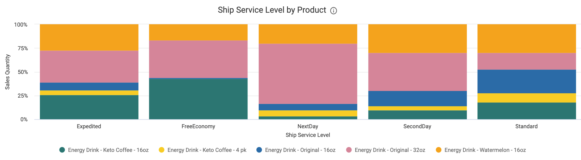
Ship Service Level by Product
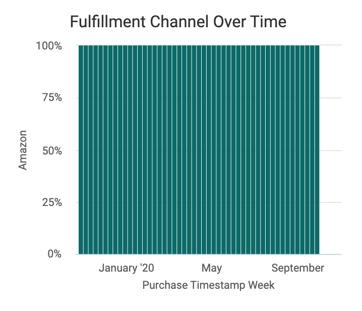
Fulfillment Channel Over Time
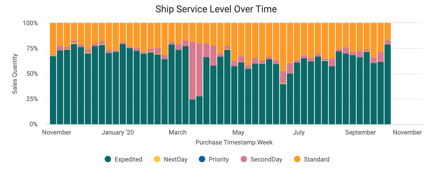
Ship Service Level Over Time
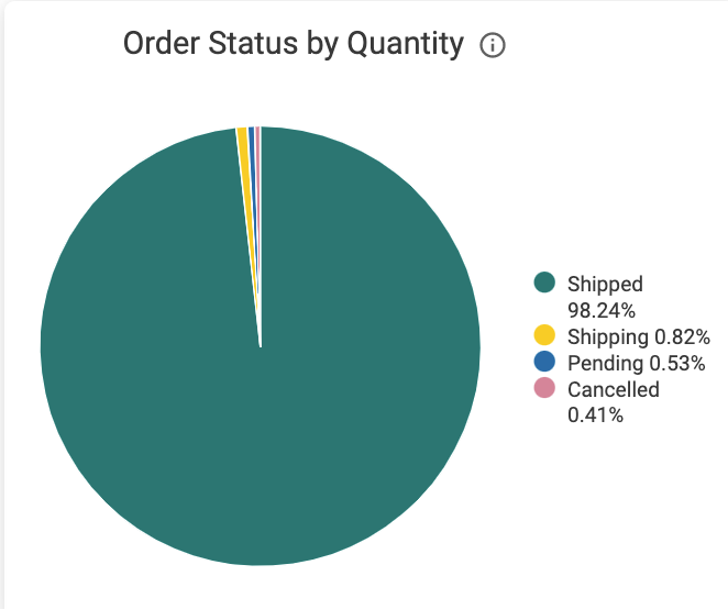
Order Status by Quantity
Promotion ID by Hour of Day
Promotion ID Over Time
Recent Order Status
Sales Quantity by Hour
A Note About the Source Data
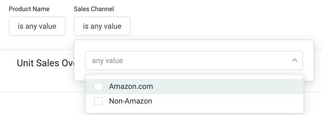
As you view the dashboard, it's important to note that Amazon Seller Central doesn't always include city or item price for non-Amazon sales channels (i.e. products fulfilled by Amazon but sold elsewhere). Because of this, we've included a sales channel filter at the top of the dashboard you can use to filter the dashboard by Amazon.com sales only:
Unit Sales Over Time
This line graph can be used to look for seasonality trends as well as look for certain correlations between marketing efforts and units sold. Hover over a data point for more details or click to apply a cross filter.
Sales in Dollars Over Time
Similar to the above graph, this represents total sales in dollars over the selected time period.
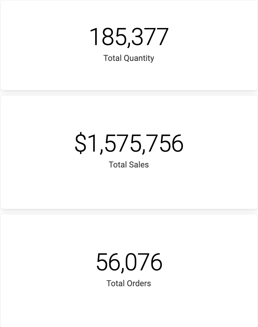
Total Quantity, Total Sales, Total Orders
These tiles offer sales summaries and provide high-level information about performance and patterns. Once you've started enabling filters, these tiles add even more context to the other visualizations, displaying volume of quantity, sales, and orders.
Please note that Total Sales is a net figure (less shipping)
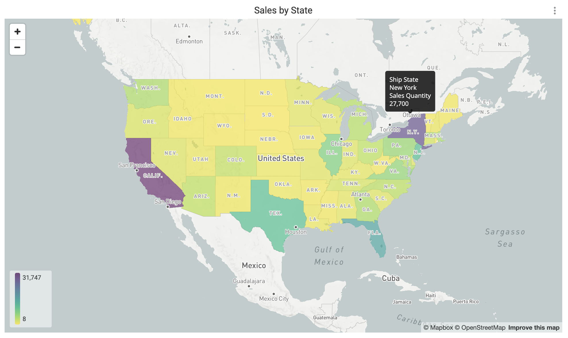
Sales by State
This regional heat map allows you to quickly observe regions where product popularity is high versus regions that are underperforming, assisting you in making SEO, digital marketing, and FBA inventory decisions. Hover over a state to see more details or right click to drill down by zip code, product, or ship service level.
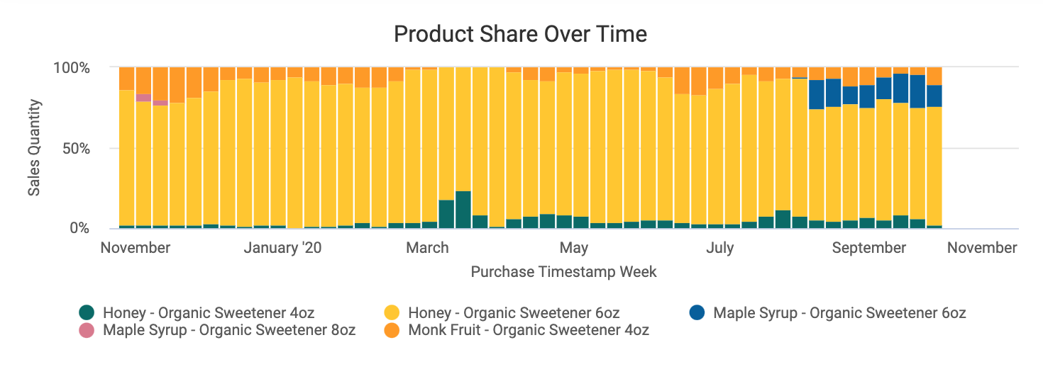
Product Share Over Time
This graph assists in seeing how product share expands or shrinks over time. By comparing share over time, you can better track new product momentum or how seasonality affects your portfolio.
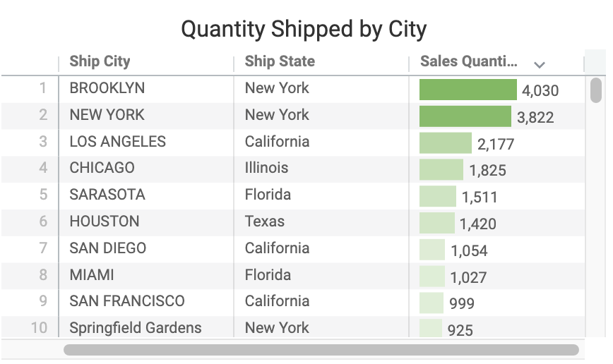
Quantity Shipped by City
This sortable table offers a look at where your products are shipped most and in what quantities, helping inform geo targeting and distribution choices in other chains and channels.
Top 10 Promotion IDs vs Quantity
This visualization displays which promotion IDs are most commonly used. This can help you measure promotional success and the success of programs like "subscribe and save." By clicking and cross filtering for "subscribe and save" you can, in essence, create a customer segment.
Quantity Shipped by Day
This bar graph offers a shipping breakdown by product and day of the week. This graph can be used to get information about products that are dominating sales on a daily basis, regardless of day, as well as whether any particular products are shipping more on a particular day.
Quantity Shipped by Time of Day
Similar to the above graph, this displays when customers shop for your products. This allows for highly targeted digital promotion management, as well as helps you identify customer patterns.
Product Discounts
This sortable table displays which products receive which discount in which quantity. By referencing the table, you can better see and measure price sensitivity and Amazon trade spend by product, as well as highlight if discounts are working.
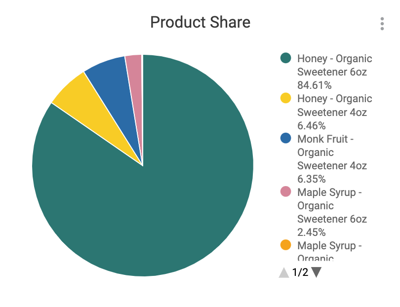
Product Share
This chart enables you to identify top products, as well as see product share by various slices (clicking will apply a cross filter to the dashboard).
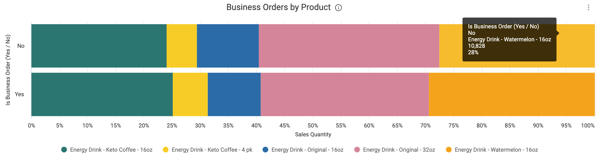
Business Orders by Product
This visualization shows product mix by business, helping you understand which products are more commercial, and which could be promoted more to business customers.
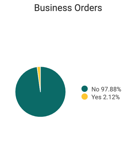
Business Orders
This chart shows the share of business orders compared to consumer orders, helping you track changes in business order growth and better understand the magnitude of business orders.
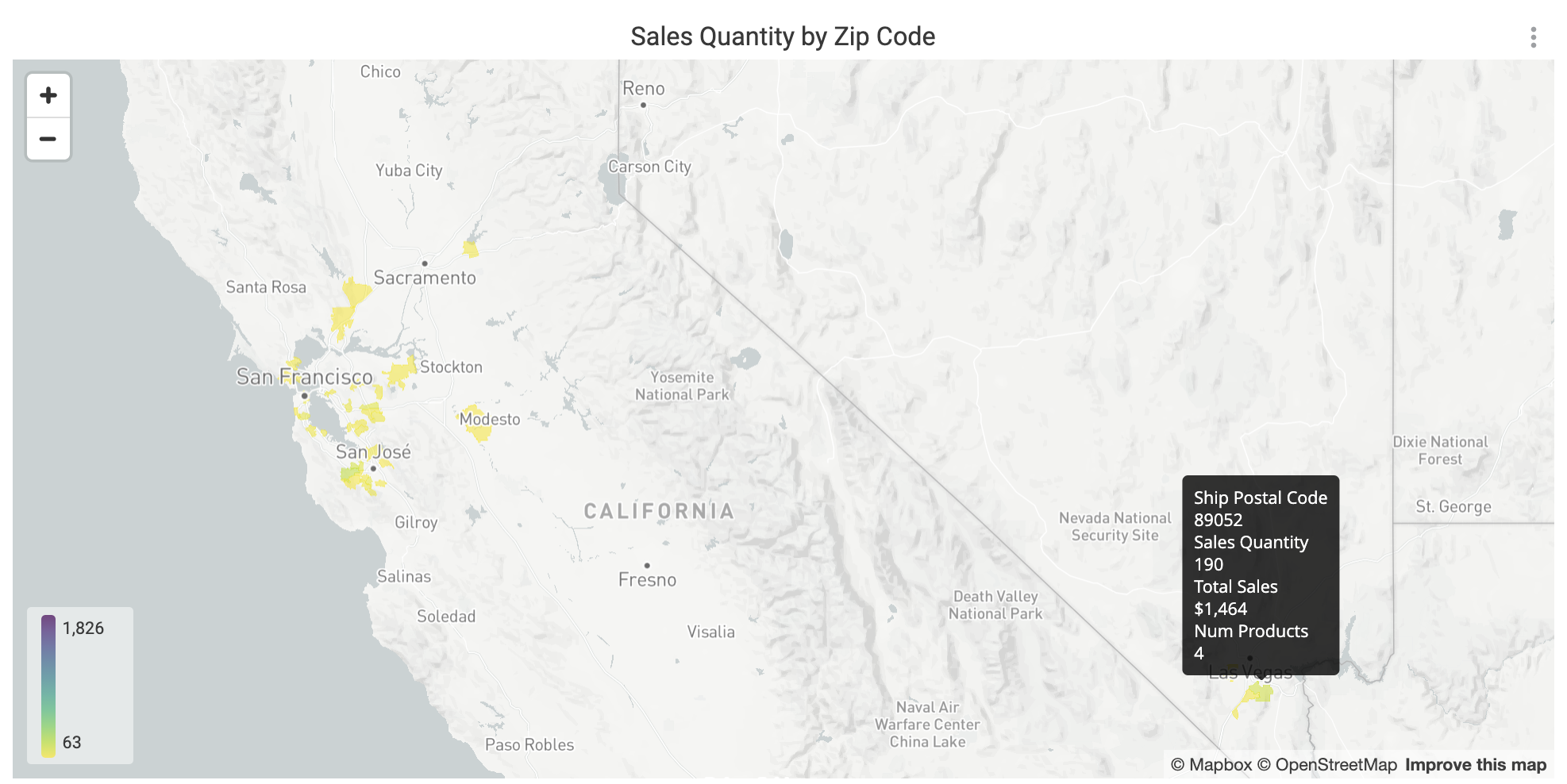
Sales Quantity by Zip Code
This heat map offers a granular look at what zip codes your products are being shipped to the most. This can be helpful in decisions such as determining digital ad spend and SEO strategy.
Ship Service Level by Product
This graph can help you glean patterns in consumer shipping-selection behavior, as well as have more targeted shipping promotions.
Fulfillment Channel Over Time
This graph shows how your products are being fulfilled, whether by Amazon or you the merchant, helping you understand fulfillment patterns.
Ship Service Level Over Time
This graph displays shipping information over time, providing an understanding of consumer urgency for product, seasonality, and how customers react to shipping promotions.
Order Status by Quantity
This pie chart shows Amazon's breakdown of the status of orders by quantity shipped. At a glance, you can see how many orders are pending or have cancelled. This can help you identify how Amazon is keeping up with orders.
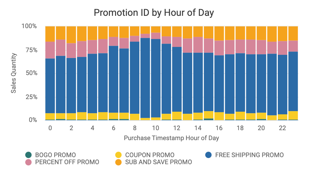
Promotion ID by Hour of Day
This clickable graph can assist you in seeing what time of day is best to run certain promotions such as flash sales, as well as help you analyze promotion success instantly. Uses PST.
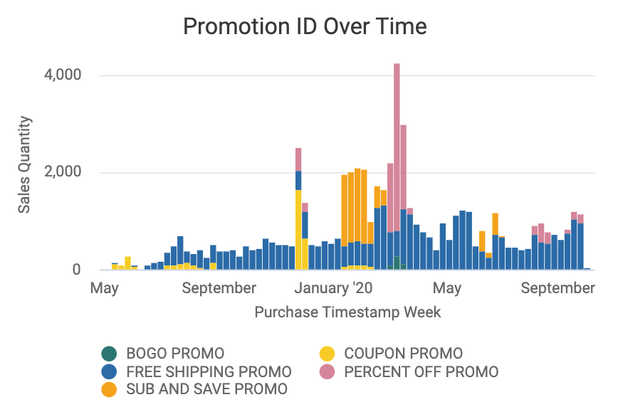
Promotion ID Over Time
This graph displays promotion ID usage on a weekly basis. By clicking and cross filtering, you can better understand how individual promotions are effecting revenue.
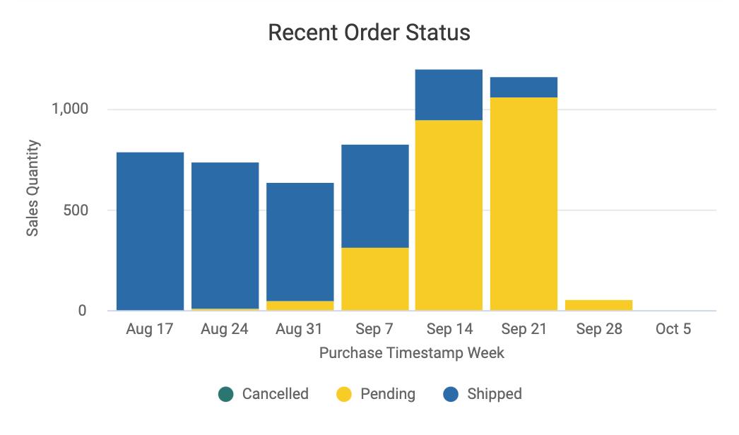
Recent Order Status
This visualization shows orders over the last 8 weeks, enabling you to track recent Amazon and third-party fulfillment performance, as well as see if pending orders are stacking up.
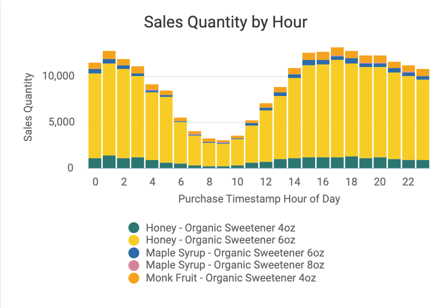
Sales Quantity by Hour
This graph identifies what hours of the day particular products sell better (or worse) in. Uses PST.