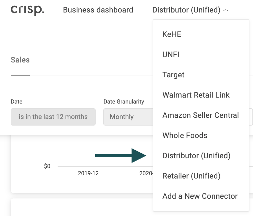
Crisp users with both UNFI and KeHE connectors can have access to a unified dashboard, allowing them to view shipping sales insights from both distributors in one location. To view the unified distributor dashboard, select click "Distributor (Unified)" from the dashboard dropdown:
This dashboard draws from your UNFI reports and KeHE's "Full POD Vendor" report. In this tutorial, you will learn about each visualization available through the Distributors (Unified) dashboard. Quickly jump to a specific visualization by clicking the links below.
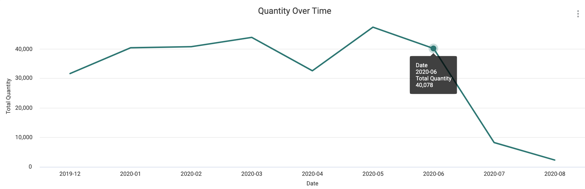
Quantity Over Time
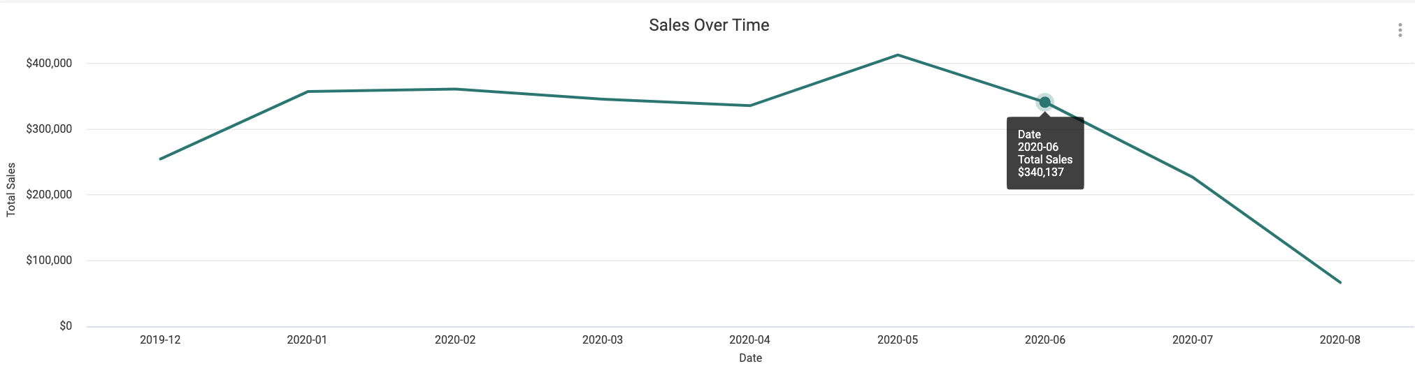
Sales Over Time
Sales by Source
Total Quantity, Sales, Products, Locations
Total Sales by Source
Sales by State
Sales by Zip Code
Product Share Over Time, Reference Chart
Sales by City
Sales by Product
Sales by Chain
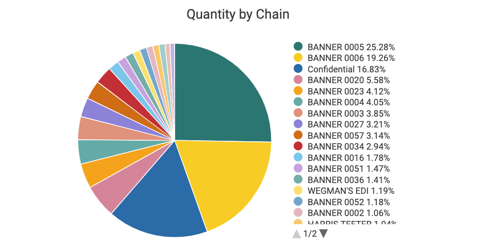
Quantity by Chain
Quantity Over Time
With the Quantity Over Time visualization, you can analyze promotions after they've happened, as well as recognize cyclical and seasonal patterns. Along with adding filters to hone in on specific products or time periods, you can also hover over data points in this graph for more information on sales units shipped.
Sales Over Time
Much like the Quantity Over Time visualization, the Sales Over Time graph can be used to both track and display patterns and growth, showing sales in dollars.
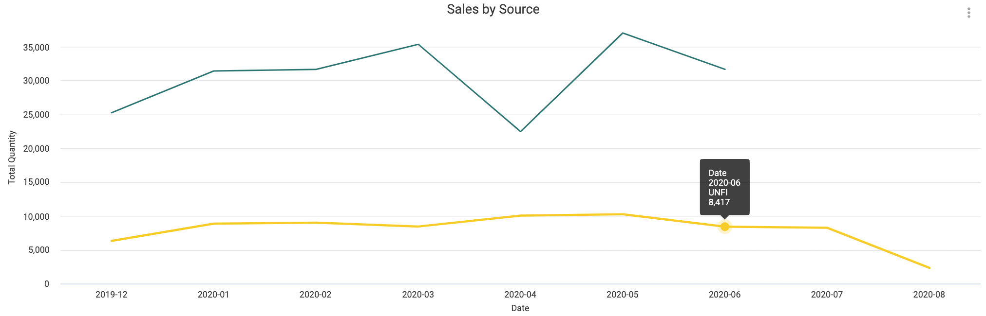
Sales by Source
This graph compares your sales in units by source, with KeHE and UNFI separated by color. Hovering will provide more information, while clicking on a data point will filter the dashboard by that date and distributor.
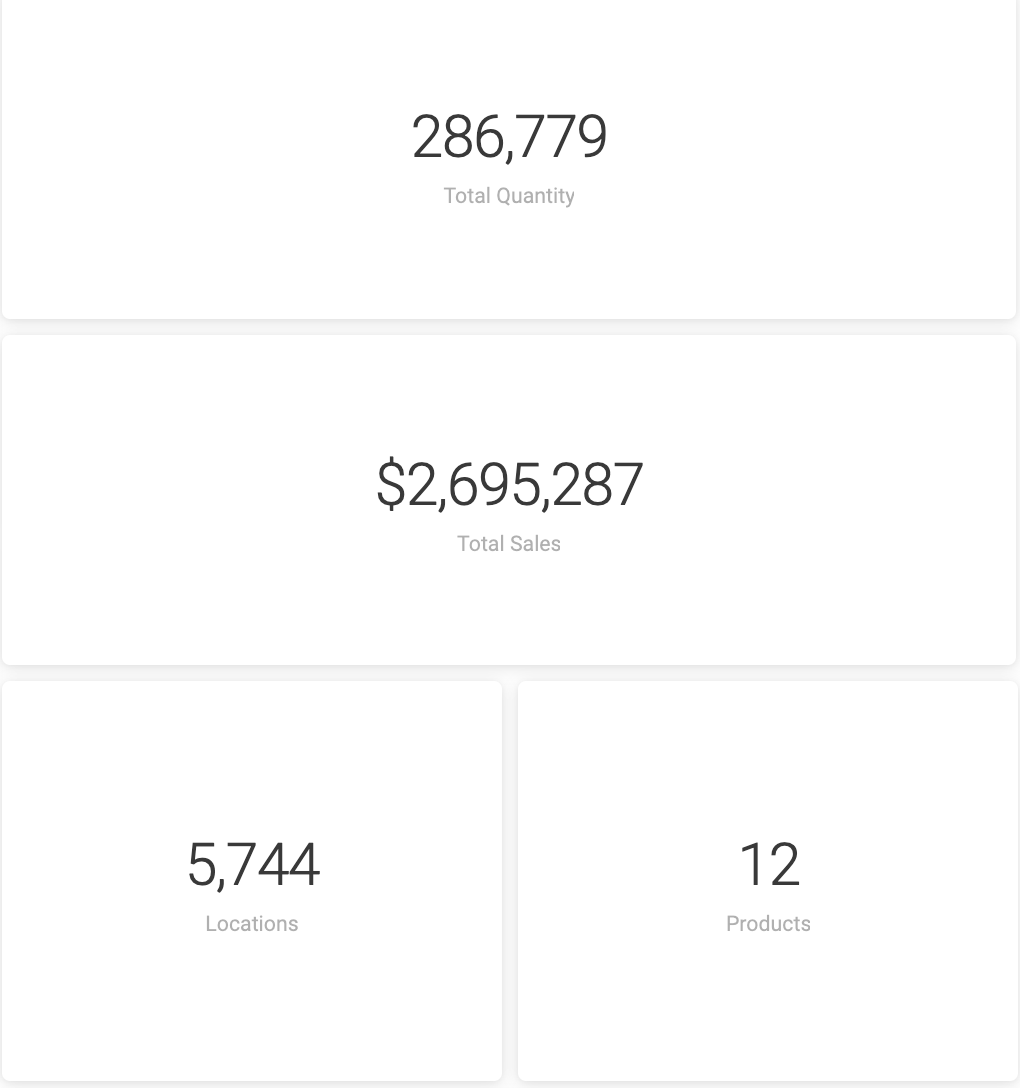
Total Quantity, Sales, Products, Locations
At a first glance, these tiles offer sales summaries and provide high-level information about your sales performance and patterns. Once you've started enabling filters, these tiles add even more context, displaying exact counts in dollars, units, products, and locations.
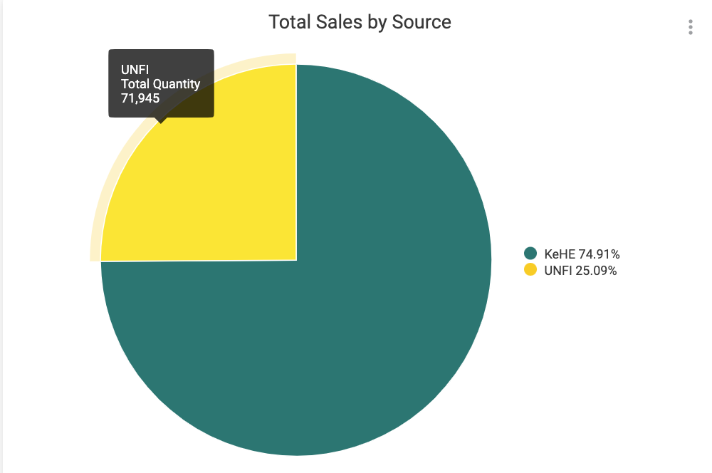
Total Sales by Source
This pie chart breaks down your total units shipped sales by distributor, providing a quick comparison of how your natural distribution channels are comparing against one another.
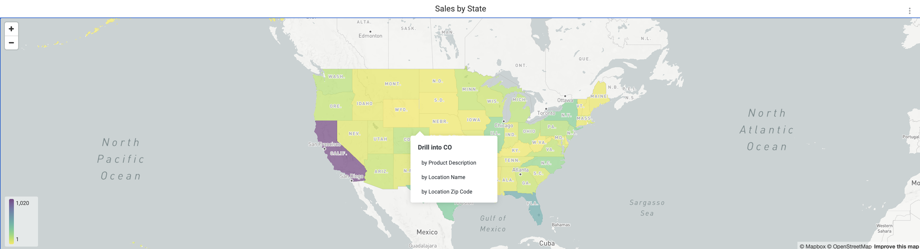
Sales by State
This regional heat map displays geo-level performance, helping you see the markets you are thriving in so that you can put energy towards growth or expansion within KeHE or UNFI. Hover for details or click to filter the dashboard tab by that state.
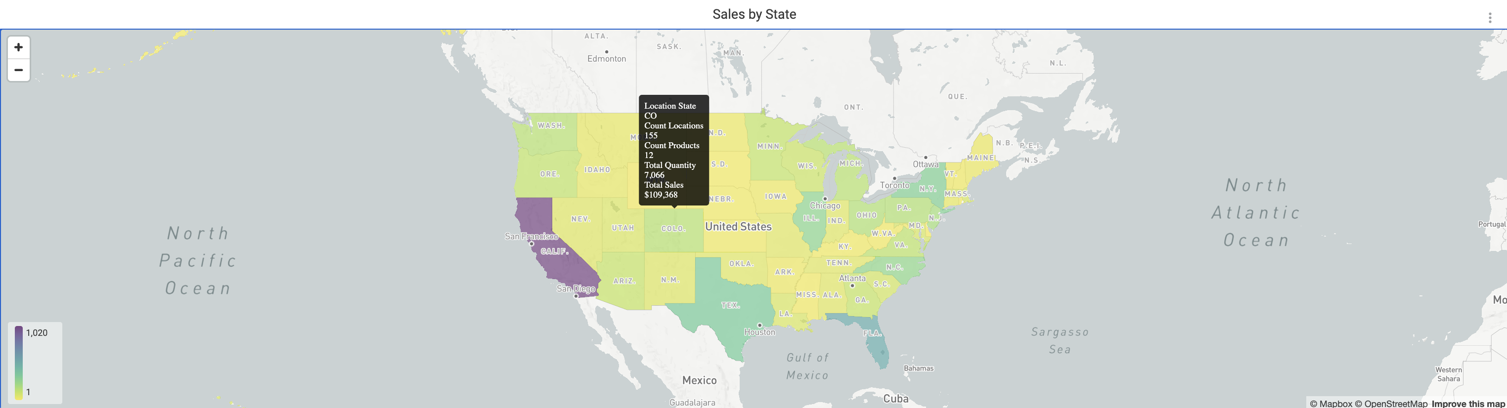
By right clicking, you can drill down by product, location name (i.e. store), or zip code.
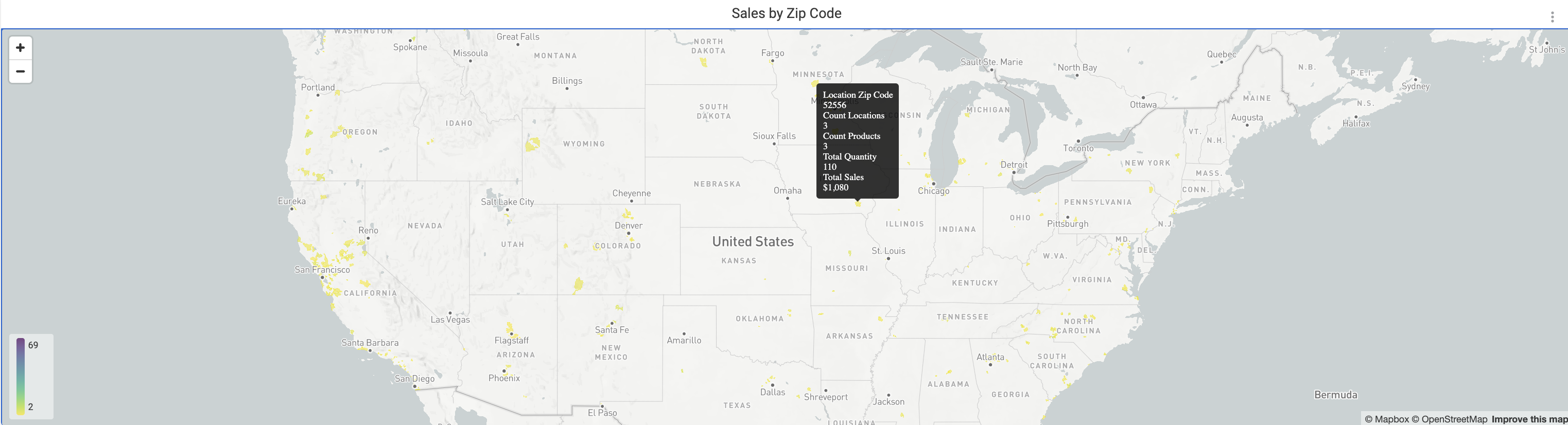
Sales by Zip Code
This heat map functions similarly to the statewide map above it, only it displays clusters by zip code. This can help you quickly visualize and spot areas of high performance or lower sales within a state.
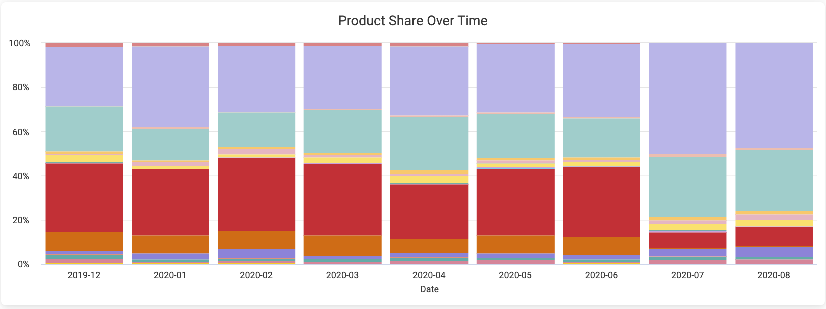
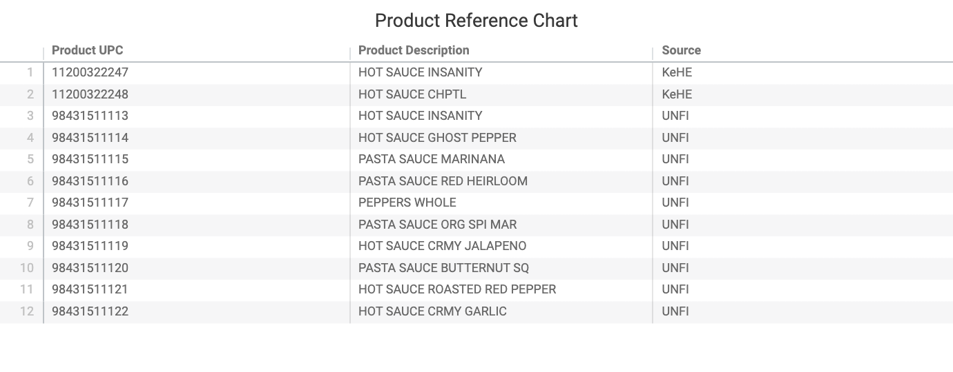
Product Share Over Time, Reference Chart
This graph assists in seeing how product share expands or shrinks over time. By comparing share over time, you can better track how new products have performed or how seasonality affects your portfolio mix. To the right is a reference chart displaying the products and UPCs that are referenced in the dashboard. Click to filter the tab by UPC, product description, or source.
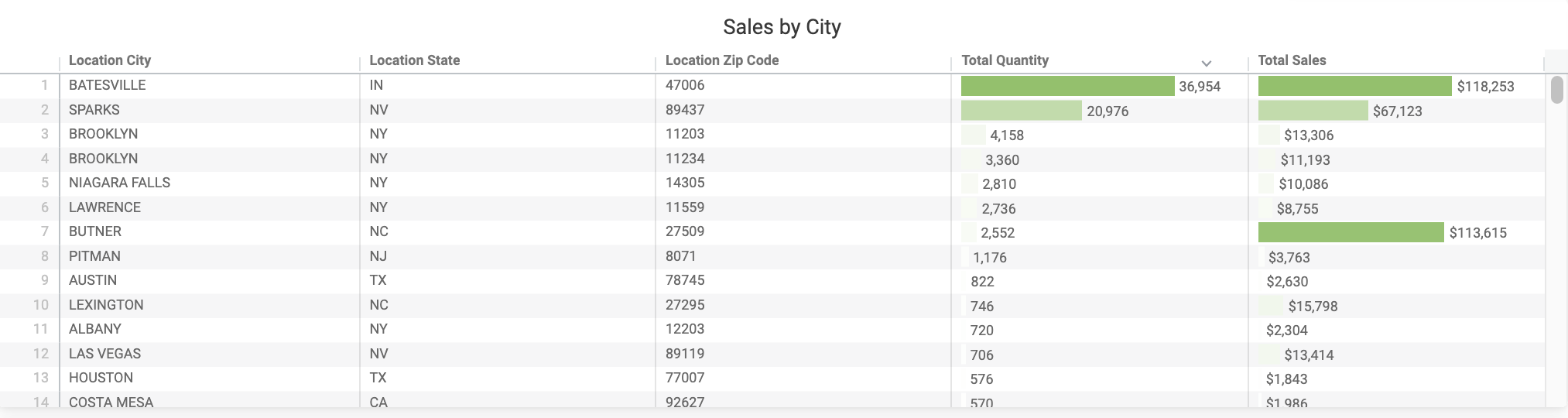
Sales by City
This sortable table can help you spot top-performing cities, which can aid in making decisions on product placement, as well as geo-targeting.
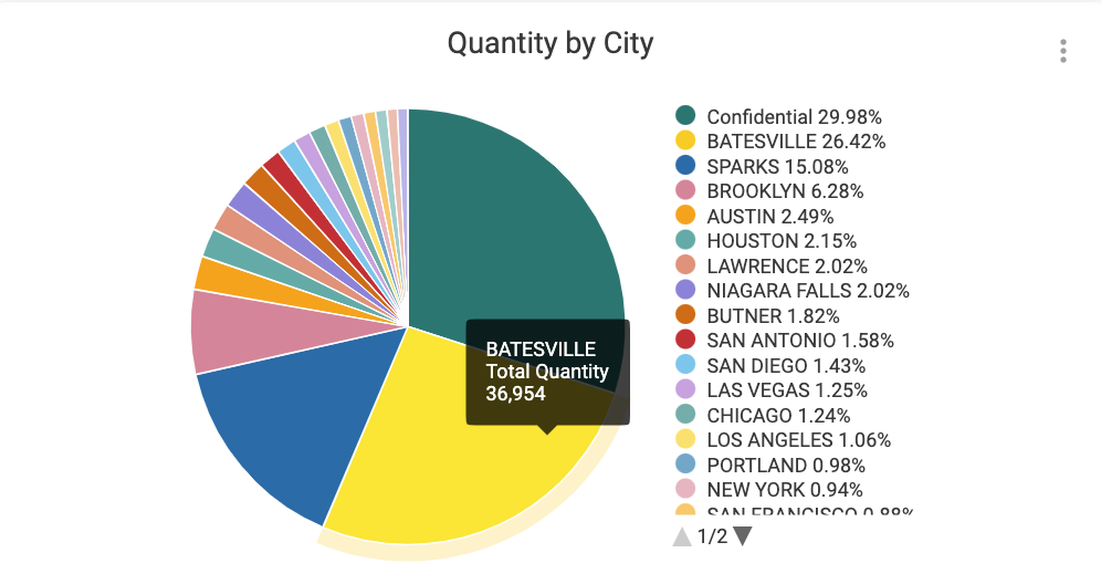
Quantity by City
This pie chart visually complements the Sales by City table, showing percentages and total quantities. Hover for additional information or click to filter the dashboard by city.
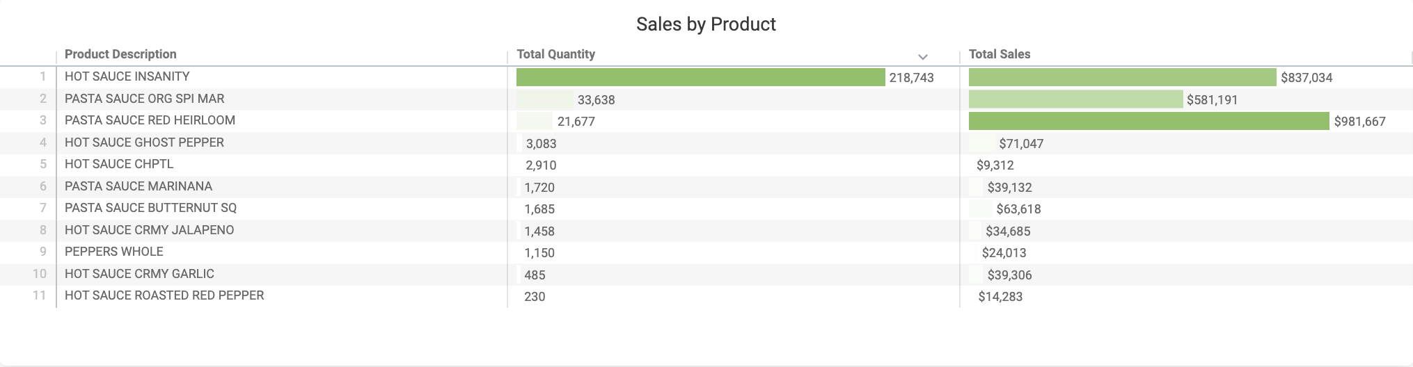
Sales by Product
This sortable table can help you spot top-performing products across your distributors. Click a column header to sort values in ascending or descending order, or click a cell to filter the tab by your selected product.
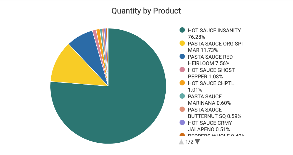
Quantity by Product
This pie chart slices your sales by product. Hover for more details or click to filter the tab by that product.
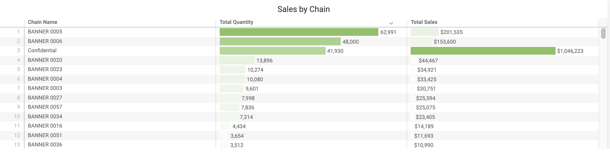
Sales by Chain
This sortable table displays your sales by chain or banner. Click a column header to sort values by ascending or descending value. Clicking on a name name will filter the tab by that chain or banner.
Quantity by Chain
This pie chart breaks down your total sales by quantity by chain or banner. Hover for more details or click to filter the tab by that chain or banner.