The visualizations in Crisp's Wegmans sales dashboard are there to help you see the bigger picture of your sales performance. In this tutorial, you will learn about each visualization available through the Wegmans sales dashboard. Quickly jump to a specific visualization by clicking the links below.
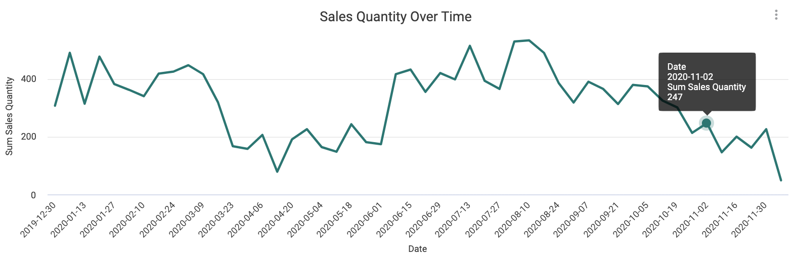
Sales Quantity Over Time
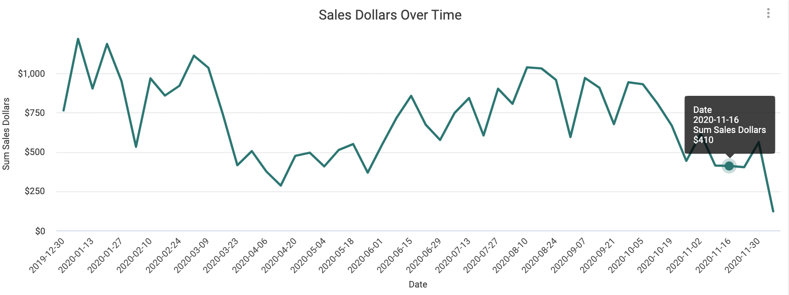
Sales Dollars Over Time
Total Sales, Products, Locations
Product Share Over Time
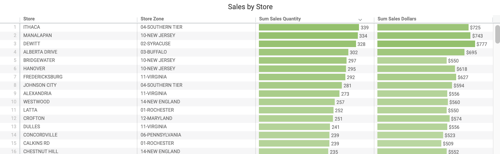
Sales by Store
Top 10 Products
Sales by Zone
Sales by Department, Department Category
Sales Quantity Over Time
This visualization identifies sales patterns over time, helping you review and make seasonal or promotional plans. You can also use this visualization to identify new item success or failure. Measured in units sold, this differs from Sales Dollars Over Time in that price changes are not automatically impacting your sales trends.
Sales Dollars Over Time
Similar to the above visualization, Sales Dollars Over Time can help you identify if a seasonal or promotional event or new item introduction was successful. Measured in dollars and thus impacted by price changes.
Total Sales, Products, Locations
At a first glance, these tiles offer sales summaries and provide high-level information about your sales performance and patterns. Once you've started enabling filters, these tiles add even more context, displaying exact counts in total dollars, units, products, and scanning locations.
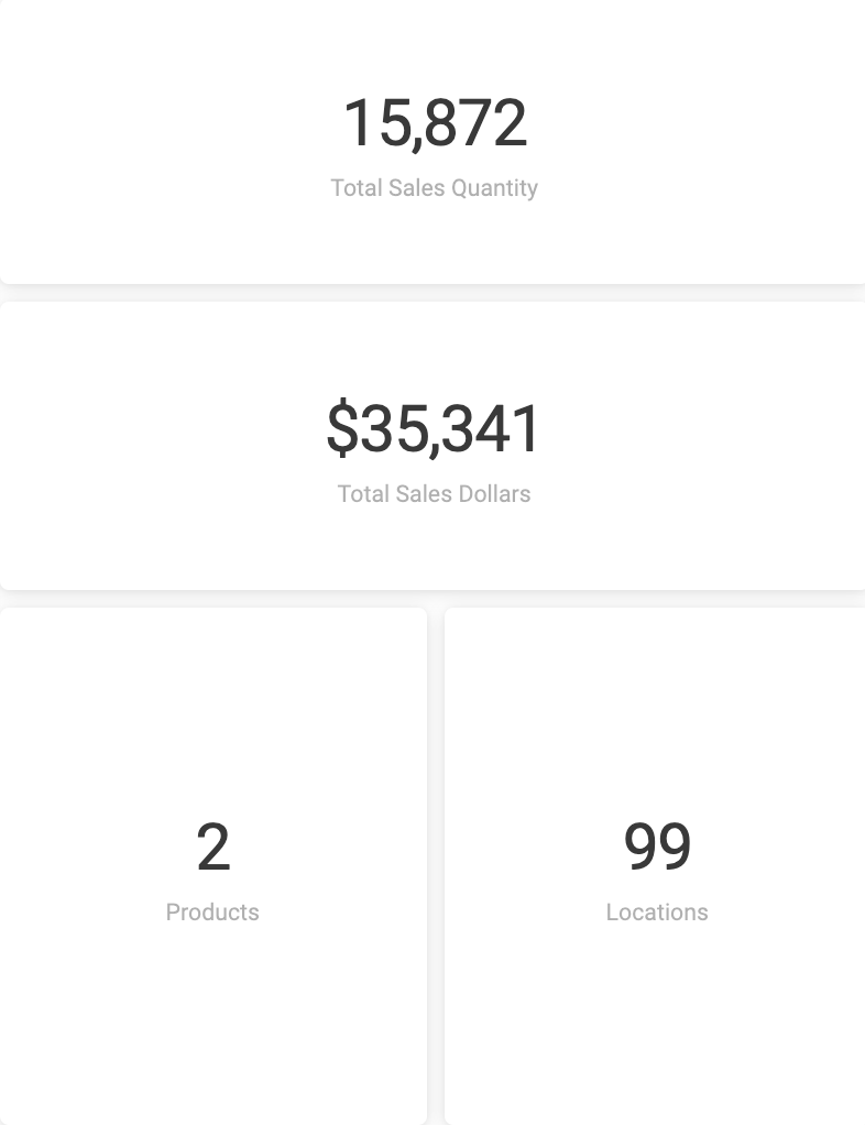
Right click on a tile's number to load a new table breaking down that figure.

Sales by Product (table)
Sales Details
This table surfaces sales by store in dollars and units, helping you monitor each store at a granular level. Cross filter the dashboard by store or by selecting a row in the table.