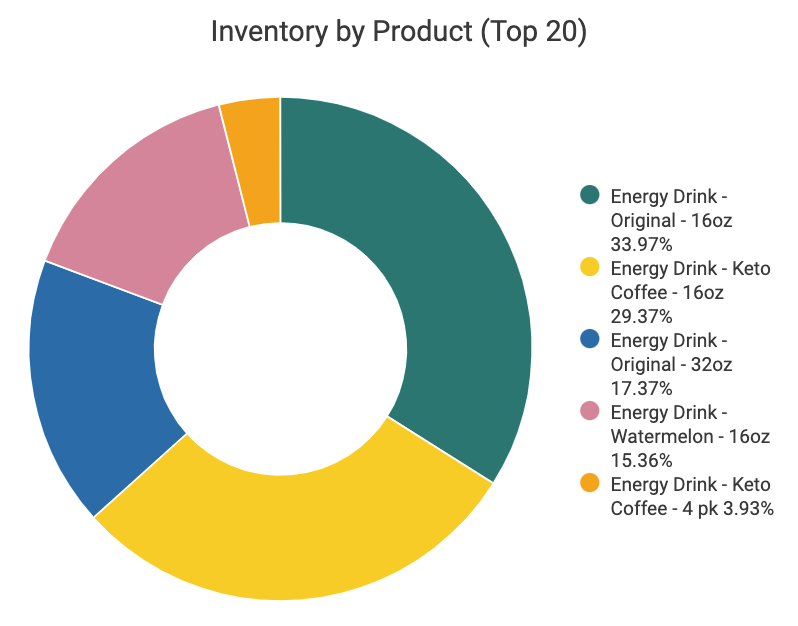
This pie chart breaks down inventory levels for your top 20 products. Hover over a slice for an on-hand number or click to filter the dashboard by that product.
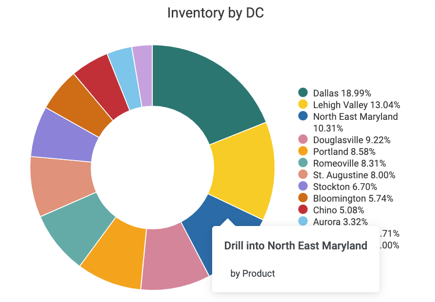
The Inventory by DC pie chart shows which distribution centers your products are in. The chart changes when other filters are applied, and you can also right click on a slice to drill down into that distribution center by product.
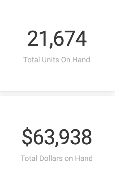
These tiles, which update with your filters, show the total units and dollar value of your on hands.
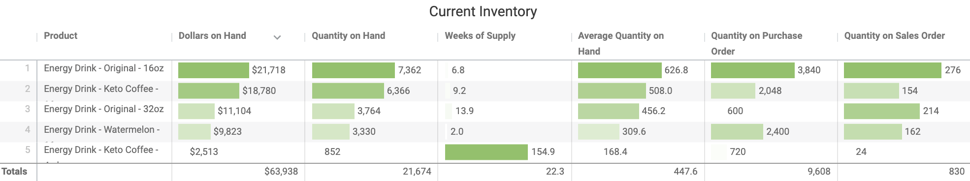
The Current Inventory table provides an overview of what's on hand, what's on purchase order, and what's on sales order.
Weeks of Supply by DC (map)
This map of your distribution centers visualizes your inventory on hand, with the colored shading representing the dollars on hand. 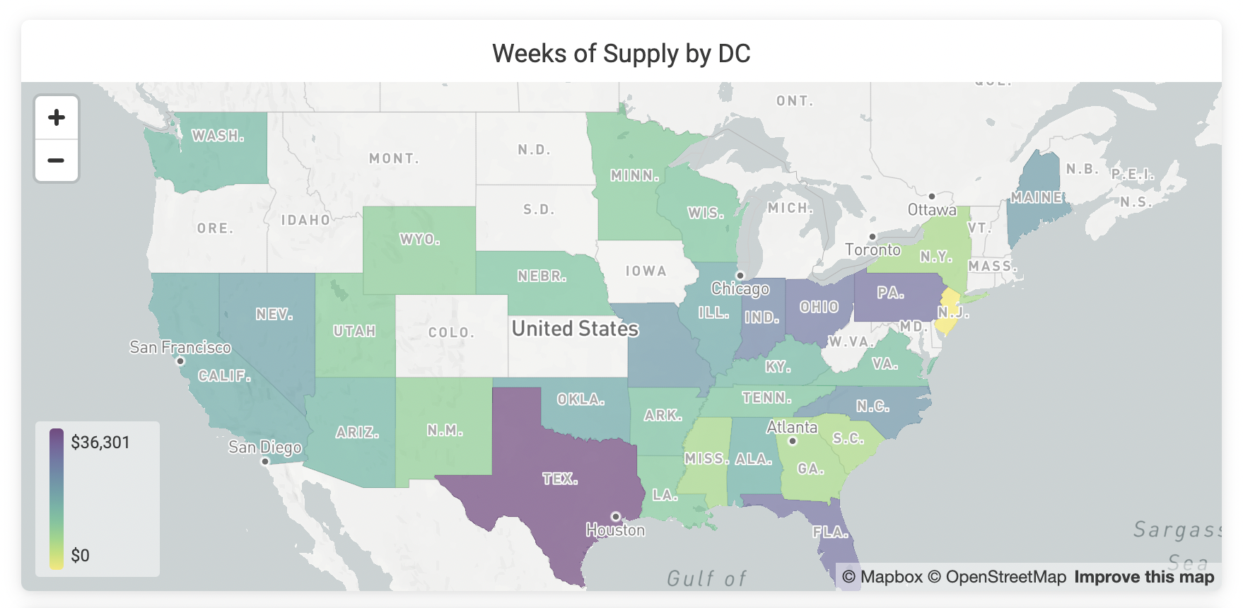
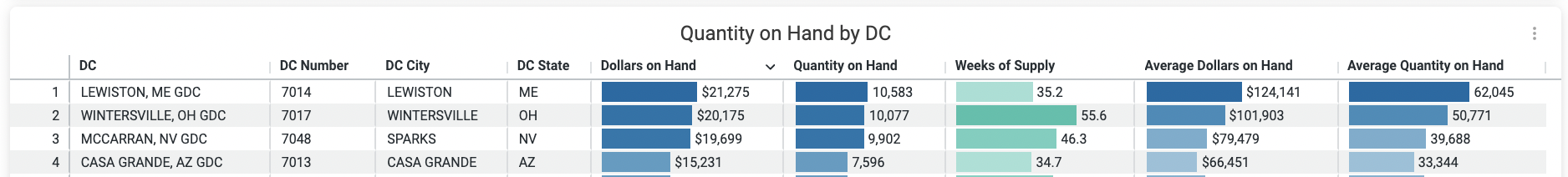
Quantity on Hand by DC (table)
Corresponding with the above map, the Quantity on Hand by DC table offers a sortable breakdown of your inventory by distribution center.
Details
The Details table at the bottom of the dashboard provides more granular product and distribution center information. Click on an individual cell to apply a cross filter.

Crisp's Inventory dashboards provide distribution center (DC) inventory data to help you easily pinpoint areas where inventory is too low or too high and identify which distribution centers are well-stocked for a promotion. The Inventory dashboard is divided into three sections:
- Overview: See a snapshot of your inventory status and what's at risk.
- Drivers: Understand the events that contribute to your inventory levels.
- Details: Dig in to granular information that helps you take action when there's a mismatch between supply and demand.