The Category Sales dashboard allows you to see how your products stack up compared to similar products and gauge your impact on the overall growth of a category to help you create compelling sell stories for buyers or address issues. The Category Sales dashboard is currently available for Wegmans.
The following sections describe the filters and visualizations in the dashboard.
Filters
You can apply the filters in the following table to your dashboard to refine the information shown in the dashboard. For more: Applying filters.
| Filter | Description |
| Select a Time Period | Select the time frame for which you want to assess category share and YOY change. Note: The time frames are fixed to allow for robust data comparison. |
| Measure Selection | Specify whether you want to view category share by volume (in units) or sales (in dollars). |
| Subcategory Selection | Specify which subcategories you want to display. Note: If you exclude subcategories, the category calculations will also exclude those same subcategories. |
| Product Selection | Specify if you want to view your products, competitor products, or both. Note: If you exclude products, category calculations will exclude those same products. |
| Store Selection | Specify whether you want to view all stores or only stores where you have products. |
Overview
The Overview section helps you understand your sales in context. Use the following map of the screen to guide you.
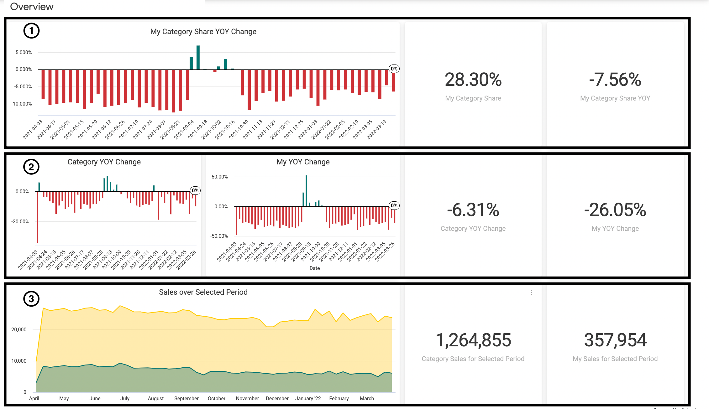
 . Category Share
- My Category Share YOY Change (chart): This drip chart in this section displays the percentage change in category share from the previous year over the specified time frame, so you can understand how your brand is gaining or losing category share to your competitors.
- My Category Share (tile): Your total category percent share over the specified time frame.
- My Category Share YOY (tile): The change in category share for your products compared to the previous year.
 YOY change
- Category YOY Change (chart)- Displays the change in sales for the categories in which you sell products compared to the previous year.
- My YOY Change (chart)- The change in sales for your products compared to the previous year.
- Category YOY Change (tile)-The total change in sales for the categories in which you sell products compared to the previous year.
- My YOY Change (tile)- The total change in sales for your products compared to the previous year.
 Sales graph and tiles
- Sales over Selected Period - Displays sales over time for the category as a whole (in yellow) and sales for your products (in green) to help you understand how your growth compares to the category growth.
- Category Sales for selected period - The total category sales for the selected time period.
- My sales for selected period- Your total sales for the selected time period.
Drivers
 Heat maps
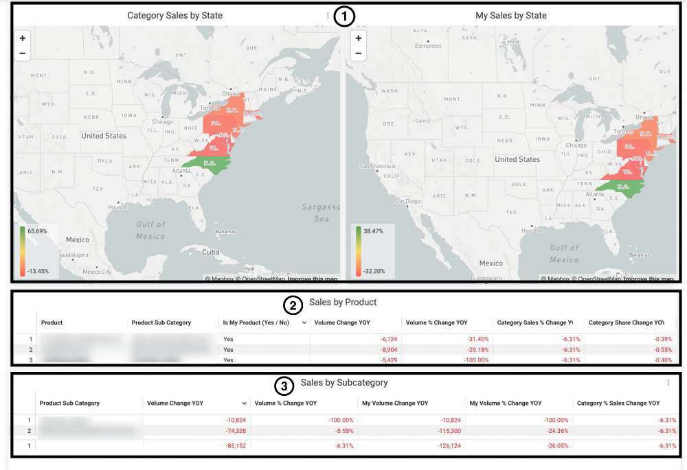
These regional heat maps allow you to hover over a state and quickly see the year over year change in growth to help you identify regions where your growth is high or low in comparison to the category overall. If available, you can see data by zip code by right-clicking a state and selecting By store zip, enabling you and your marketing team to make more strategic decisions regarding SEO and distribution.
- Category sales by state- This heat map allows you to see states where category growth is high versus regions that are underperforming.
- My sales by state- This heat map allows you to see states where your product growth is high versus regions that are underperforming.
Sales by Product
This sortable table shows your top-growth products and updates based on your selected filters.
Hint: For Wegmans, the prefixes in the Product column in this table indicate the distributor that provided the given product. The prefixes are as follows:
-
ST- UNFI
-
RV- River Valley Cavallaro
-
WB- Wegmans Brand Private Label
-
No Prefix- Direct distribution
Sales by Subcategory
This table allows you to gauge how your products stack compared to others in your subcategories and updates based on your selected filters.
Details
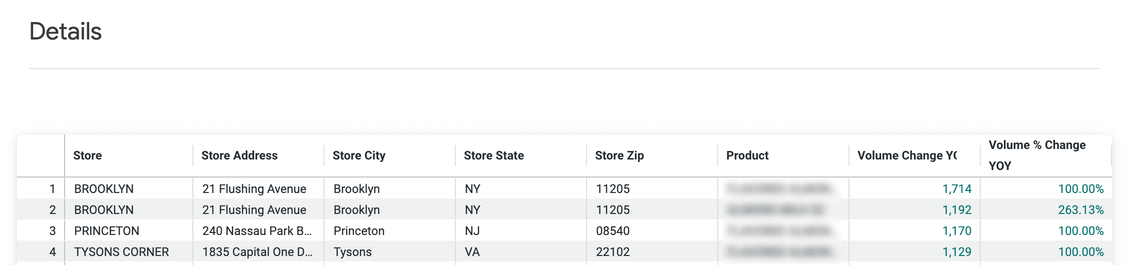
The Details table displays change at the individual product/store level. You can apply filters at the top of the dashboard, then download this visualization to get a store list that you can share and use to take action to maximize growth.