Velocity data tells you how well your product sells when it’s on the shelf to help you assess and compare the health of your products, even when they are not sold in the same number of stores. For more on how Crisp calculates velocity, see: Velocity Calculation Details.
Crisp's Year Over Year Velocity dashboard has three sections:
- Overview: Provides the big picture of what's going on with your velocity.
- Drivers: Helps you understand what events are contributing to your velocity.
- Details: Provides granular information you can act on to improve your velocity.
Note: Visualizations may vary depending on which retailer or distributor is selected. Distributor dashboards (e.g. UNFI, KeHE) are based on shipping sales, while retailer dashboards (e.g. Walmart, Whole Foods) are based on scanning sales. Also, filtering to include or exclude zero sales weeks will impact your dashboard.
Quickly jump to a specific section by clicking the links below.
Velocity Overview
Velocity Drivers
Velocity Detail
Zero Sales Weeks
Excluding Zero Sales Weeks
Including Zero Sales Weeks
Velocity Calculation Details
Velocity Overview
Units (or Cases Shipped) Per Store Per Week Over Time
This graph shows your year over year velocity each week over the selected time period based on the number of stores you sold in each week.
Note: This visualization excludes weeks where there were zero sales, regardless of what you have selected in the Zero Sales Weeks filter at the top of the screen.
Retailer dashboards display "Units Per Store Per Week Over Time," which shows units sold. Distributor dashboards display "Cases Shipped Per Store Per Week Over Time," which is based on shipping sales. As velocity is a major measure of success for each individual product, measuring it over time allows you to see what times of year or promotional events drove a product's success or failure.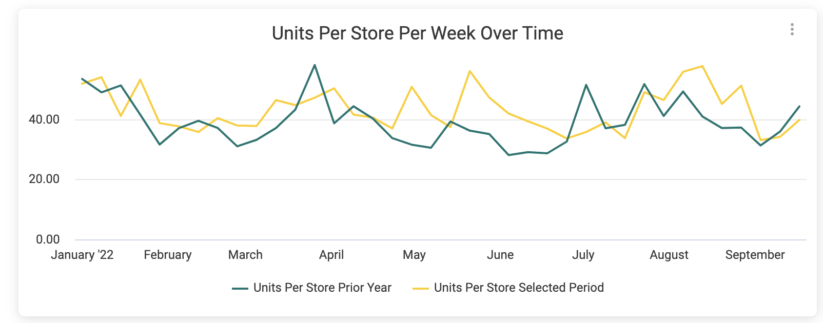
Retailer-specific example
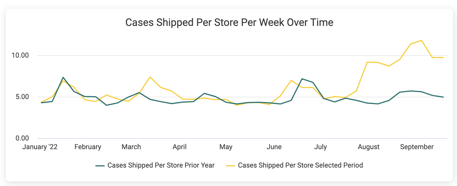
Distributor-specific example
Year Over Year Units Sales/Cases Shipped
This visualization allows you to track and display patterns and growth by viewing sales in units (or cases) sold. You can hover over a data point for more information or select it to apply a filter.
Note: The green line represents your sales quantities during the prior year for the time period you have set in the Select a Time Period filter at the top-left of the screen. When you hover over the green line, you will see the current time period date and the sales quantity from that date the previous year.
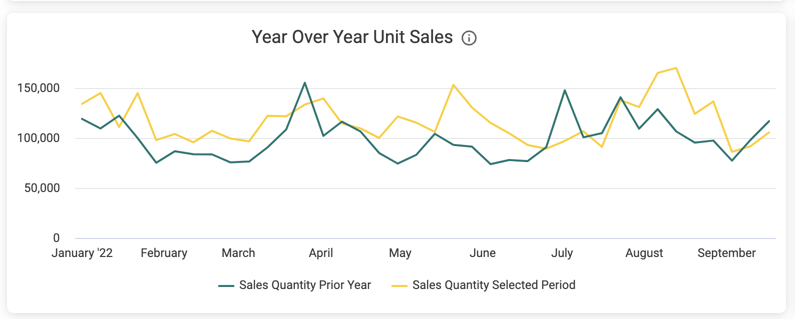
Retailer-specific example
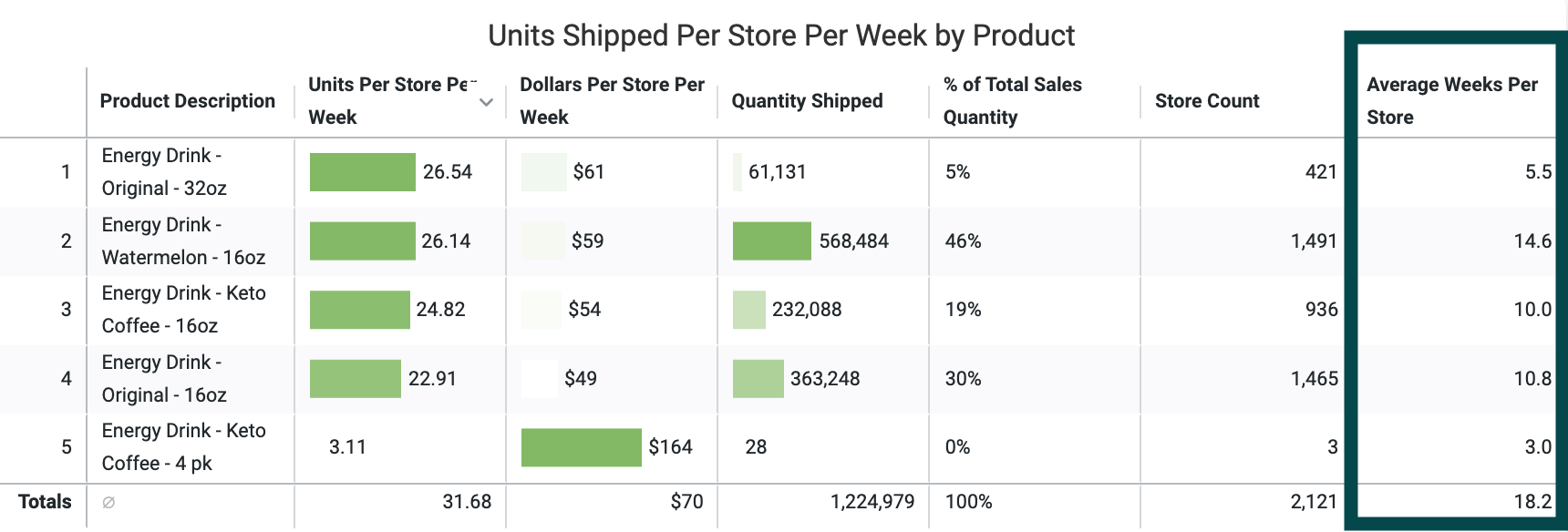
Year Over Year Units (or Shipped) Per Store Per Week by Product
In this sortable table, Crisp displays each product's year over year velocity calculated using the total number of stores you sold in over the entire selected time frame. Retailer dashboards display "Year Over Year Units Per Store Per Week by Product," which is based on scanning sales, while distributor dashboards display a "Year Over Year Shipped Per Store Per Week by Product" table. These tables can provide a quick reference or help you compare different product velocities against one another.
Note: You can control whether or not this table includes data for weeks when there were zero sales by adjusting the Zero Sales Weeks filter at the top of the screen.
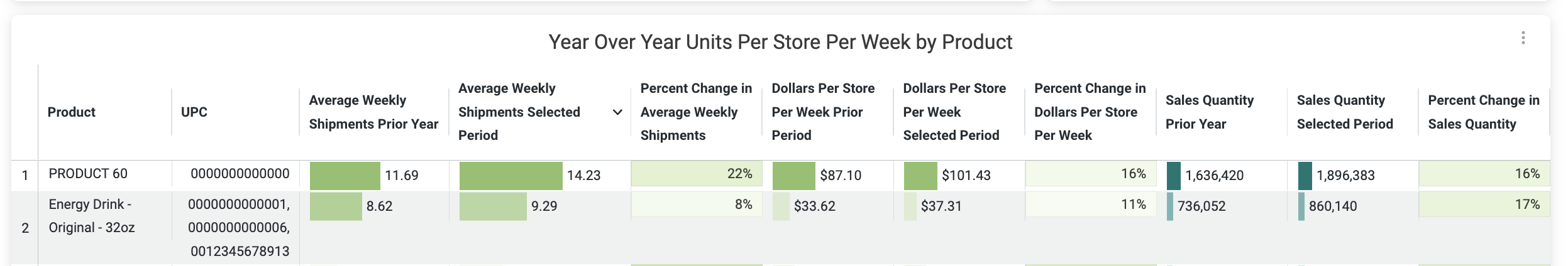
Retailer-specific Example
Overview tiles
Units Per Store Per Week for Selected Period, Unit Sales for Selected Period
These tiles are dynamic calculations showing your total portfolio's velocity. Distributor dashboards will display a "Shipped Per Store Per Week" tile, while retailer dashboards will show an average of "Units Per Store Per Week."
Note: The tiles and tables in this section show aggregate data calculated using the total number of stores you sold in over the entire time period filtered for, while the data points in the Per Store Per Week Over Time line chart are based on a single week time frame and the number of stores that had sales that week.
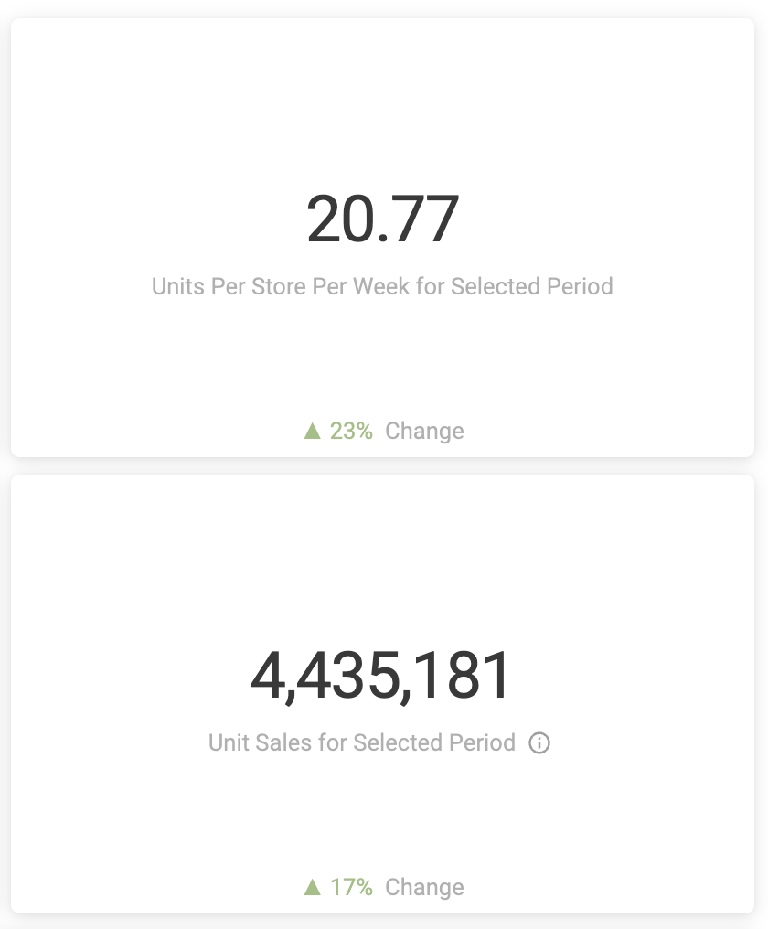
Retailer-specific Example
Velocity Drivers
Year Over Year Units Per Store Per Week by State
This visualization displays percent change in units/cases year over year with darker green representing higher percent change (more growth) and darker orange representing lower percent change (less growth). This can be useful for refining SEO decisions or informing digital marketing campaigns. Hover over this heat map for more details at the state level or right-click on a state to drill down further. As with the rest of the Velocity dashboard, retailer dashboards will be based on scanning sales, while distributor dashboards will be based on shipping sales.
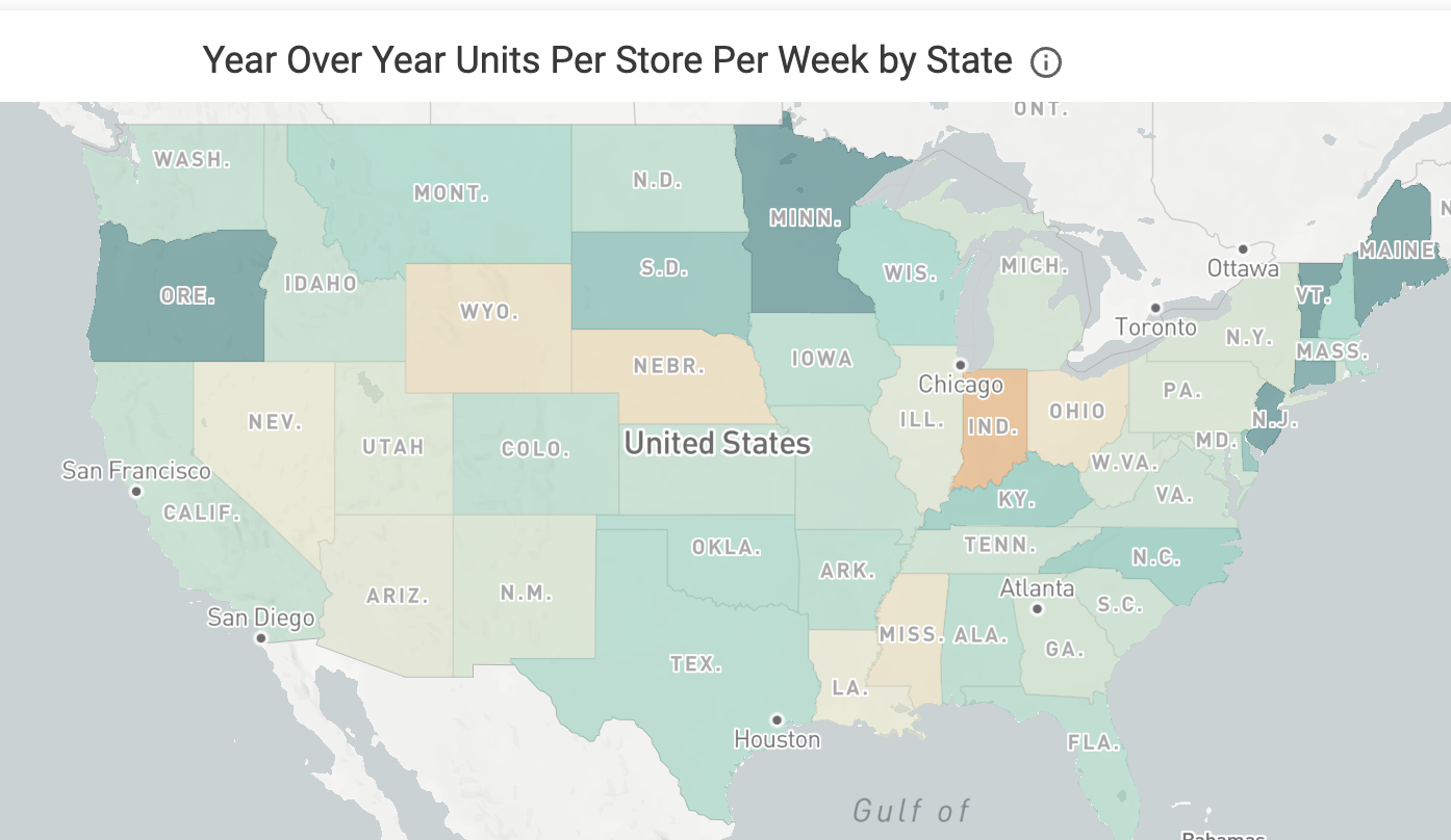
Retailer-specific Example
Year Over Year Velocity by Dimension
These sortable tables take the basic "Units Per Store Per Week" measurement and slice them by dimensions such as city, channel, chain, region, and more. The exact tables will differ based on which retailer or distributor dashboard you're viewing (e.g. "Units Per Store Per Week by Store Square Footage" would be available for the Wegmans dashboard but not the Target dashboard).
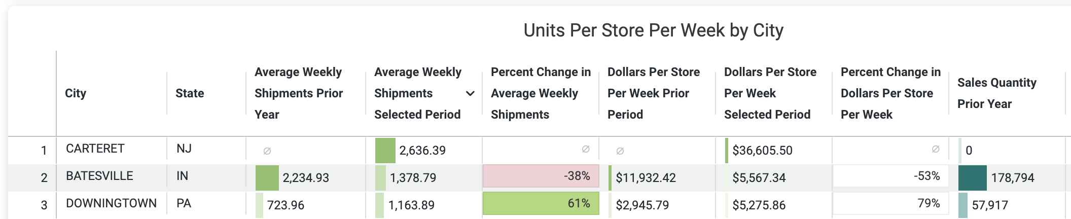
Retailer-specific Example
Year Over Year Velocity Details
The final section of the dashboard offers detailed information specific to that retailer or distributor in a sortable table. This can be especially useful after filtering for dimensions such as state. For instance, by filtering the dashboard by a low-performing state and then clicking the "⋮" ellipses in the top right corner of the table, you could download information that would help as you you look into factors affecting velocity such as in-store demos, facing, and inventory.
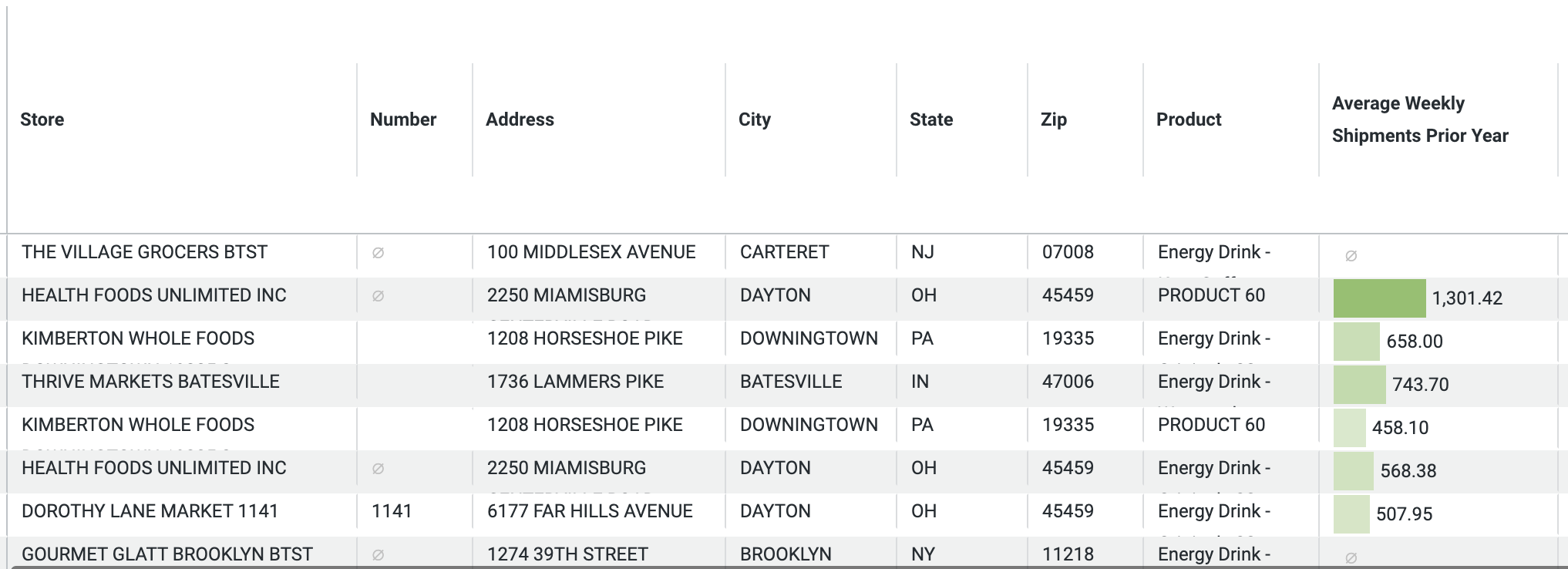
Retailer-specific Example
Zero Sales Weeks
Whether due to shipping delays, out of stocks, or irregular buying patterns, there can be weeks in which one or more of your products don't register as being sold. With that often being the case, what's the best way to measure your velocity? Crisp provides two options to help you get down to the details:
Excluding Zero Sales Weeks
All Velocity dashboards provide the option to filter out, or exclude zero sales weeks from your data.

When excluding zero sales weeks, your velocity will be based on the average number of weeks with sales per store within the date filter.


Excluding zero sales weeks can be useful when:
- Looking at distributor shipment data. Shipments don't always happen on a regular schedule, and velocity may only make sense when looking at weeks in which shipments actually occurred.
- You know you had a period of widespread out of stocks. Setting the filter to exclude zero sales weeks eliminates the effect that period would have on your velocity numbers.
- Telling the best sales story. By using the filter in this way, you're saying that when your product sells, it sells at this rate.
- Wanting to get velocity numbers for seasonal, holiday-driven, and products with specific buying patterns such as those timed with SNAP benefits.
Including Zero Sales Weeks
All Velocity dashboards provide the option to filter to include zero sales weeks in your data.
When including zero sales weeks, your velocity will be based on the number of weeks within your filtered date range.
Including zero sales weeks can be useful when:
- Buyers request you to calculate velocity including zero weeks.
- You want a conservative (and more realistic) picture of your velocity.
- Performing financial or demand forecasting, as the units per store per week figure may be used as a baseline.
Velocity Calculation Details
Crisp calculates velocity using the following method:
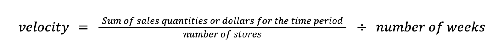
Since there are no averages involved in the velocity calculation, each velocity calculation will be unique. For example, in the following Units Per Store Per Week visualization, we see that the velocity for 1/9/2021 is 32.68.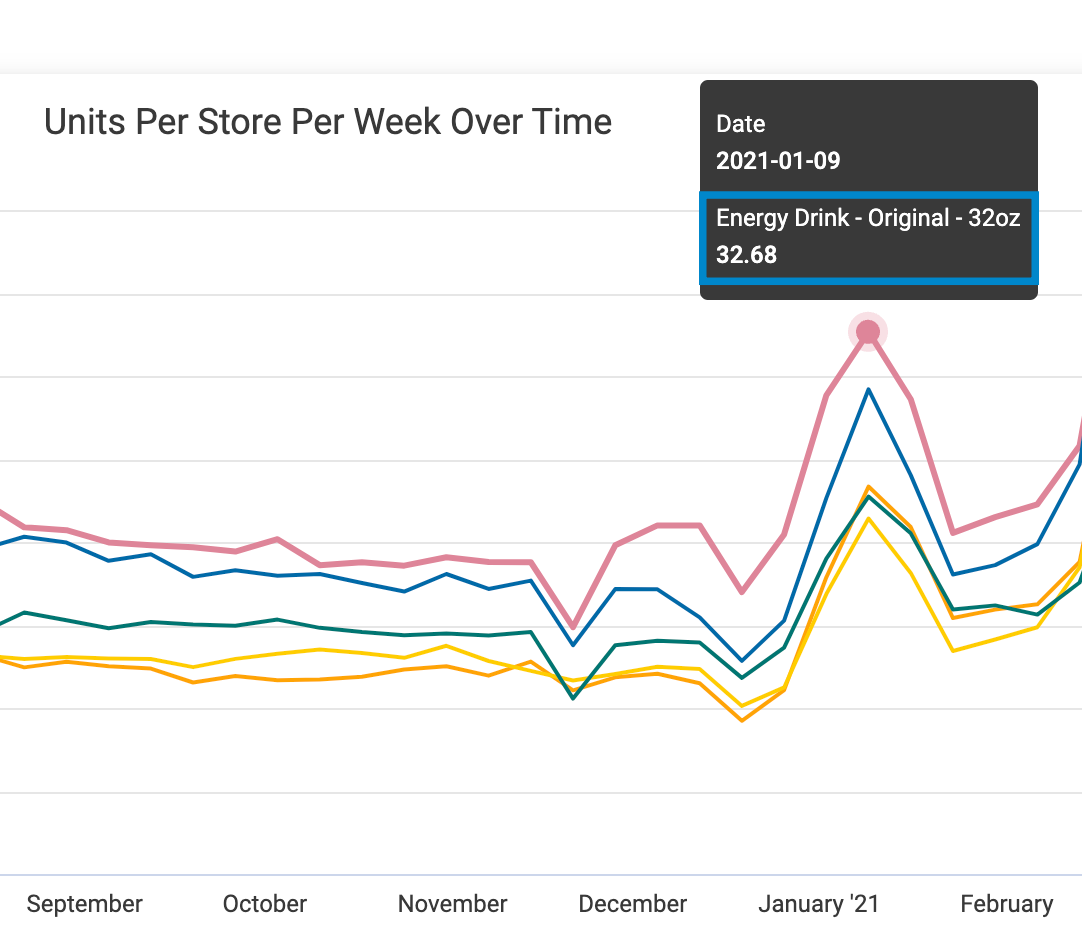
The velocity is calculated as follows: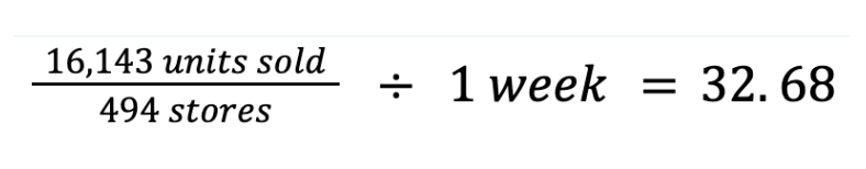
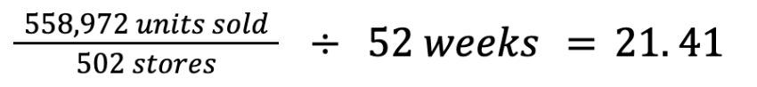
If you look at the same product in the Units Per Store Per Week table shown in the following image, you see that the velocity is 21.41.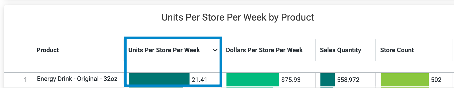
That's because the velocity in the table is calculated using the total number of stores the product sold in over the entire time period specified in the date filter, rather than the stores the product sold in during a single week. Here, the velocity is calculated as follows: